 Worldwide Shipping
 Secure Payments
 Free Return
 Local Support
-da0801079a650a2e.jpeg)
17 Year Anniversary Quotes: 110+ Funny, Romantic & Furniture Wishes (2026)
Mar, 12 2026
Learn how to select, pair, and apply retro fonts that actually sell on custom apparel. This guide covers five decades of vintage typography styles with practical tips for print-on-demand designers.
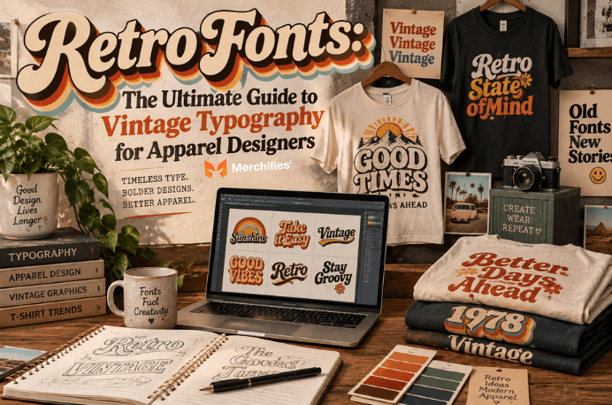
According to Lucas Bennett's analysis of vintage-inspired apparel design, retro fonts are modern typefaces deliberately crafted to evoke the visual aesthetics of past decades, from the atomic optimism of the 1950s to the grunge rebellion of the 1990s. These typography styles do more than decorate a t-shirt. They trigger instant emotional recognition, connecting wearers to cultural moments they either lived through or wish they had. For print-on-demand sellers, understanding retro typography transforms random design choices into deliberate decisions that resonate with specific audiences.
As of fall 2026, nostalgia-driven apparel continues to outperform trend-chasing designs because vintage aesthetics carry built-in emotional weight. A 1970s Cooper Black headline feels warm and familiar. An 80s neon script signals fun and excess. Knowing why these associations exist helps you select fonts that match your design themes authentically rather than accidentally.
Retro fonts work best when you match the typography era to your design's cultural reference point.
Match font era to your design's cultural reference
Test legibility at actual print sizes before finalizing
Verify commercial licensing before selling any product
Pair decorative headlines with clean supporting fonts
Retro fonts are contemporary typefaces designed to capture the visual language of specific past eras, distinct from authentic vintage typography that was actually created during those periods. This distinction matters for apparel designers because retro fonts offer modern technical advantages like extended character sets, clean vector outlines, and verified licensing while still delivering that unmistakable throwback aesthetic.
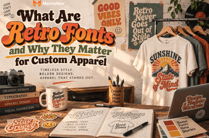
The emotional connection these fonts create explains why they consistently sell. When someone sees a bowling alley script on a t-shirt, they feel the 1950s even if they were born in 1995. When neon chrome letters flash across a hoodie, they sense the 1980s arcade without needing explanation. This instant recognition converts browsers into buyers because the font does the storytelling work before the wearer says a word.
For print-on-demand sellers specifically, retro typography offers a strategic advantage. Unlike trend-based designs that spike and crash, vintage aesthetics maintain steady demand across seasons. The 70s never stops being cool. The 80s never stops being referenced. Building a catalog around well-executed retro fonts creates products with longer sales windows and broader appeal than chasing whatever is trending this week.
Understanding typography history also prevents common design mistakes. Mixing a 1960s psychedelic headline with a 1980s synthwave color palette creates visual confusion rather than cohesion. Knowing which fonts belong to which era helps you build designs that feel intentional and authentic, which customers notice even when they cannot articulate why one design feels right and another feels off.
Retro fonts share several visual elements that distinguish them from modern minimalist typography: bold weights, decorative serifs or stylized terminals, geometric foundations, and personality that prioritizes expression over pure readability. Where contemporary design often favors clean neutrality, retro typography embraces character and distinctiveness.
Common characteristics across most retro eras include heavier stroke weights than modern fonts typically use. Thin, delicate typefaces rarely evoke nostalgia because mid-century advertising and signage demanded visibility from across streets and store aisles. This practical origin explains why retro fonts tend toward boldness even when used for modern purposes.
Decorative elements also separate retro from modern typography. Serifs might curve dramatically or terminate in rounded balls. Sans-serif letters might feature rounded corners or geometric perfection. Script fonts often include elaborate flourishes that would feel excessive in contemporary design but feel perfectly appropriate when channeling specific decades.
Color palettes and textures complete the retro aesthetic on apparel. Even the most authentic retro font loses its vintage feel when printed in stark black on white cotton. Muted tones, limited color palettes, halftone textures, and deliberate distressing help fonts communicate their intended era. A 1970s headline in harvest gold and avocado green reads differently than the same font in modern neon pink, even though the letterforms are identical.
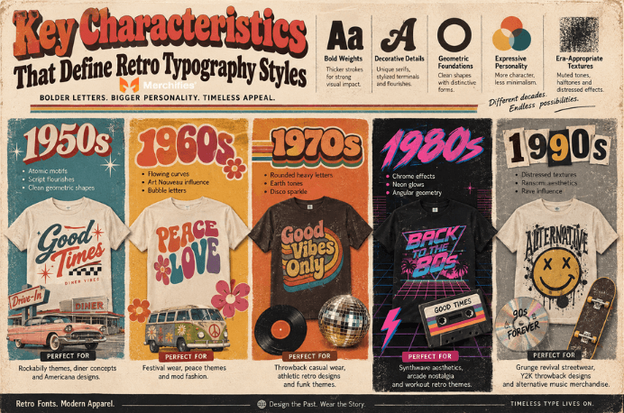
Here is how each era breaks down in terms of characteristics and apparel applications:
1950s typography features atomic motifs, script flourishes, and clean geometric shapes. These fonts work exceptionally well for rockabilly themes, diner concepts, and Americana designs.
1960s typography brings flowing curves, Art Nouveau influence, and bubble letters to the table. Festival wear, peace themes, and mod fashion benefit from this era's distinctive look.
1970s typography delivers rounded heavy letters, earth tones, and disco sparkle. Throwback casual wear, athletic retro designs, and funk themes pair naturally with these fonts.
1980s typography introduces chrome effects, neon glows, and angular geometry. Synthwave aesthetics, arcade nostalgia, and workout retro themes demand this decade's visual language.
1990s typography showcases distressed textures, ransom aesthetics, and rave influence. Grunge revival streetwear, Y2K throwback designs, and alternative music merchandise call for this era's rebellious style.
Understanding these characteristics enables confident font selection. When a client requests a vintage sports design, you know 1970s rounded fonts match classic athletic aesthetics. When designing festival merchandise, 1960s psychedelic curves feel appropriate. This knowledge transforms guesswork into deliberate creative choices.
The 1950s brought optimistic, forward-looking typography characterized by atomic age motifs, elegant script fonts, and clean geometric shapes that reflected post-war prosperity and space-age excitement. Bowling alley scripts with dramatic swashes, diner-style lettering with rounded terminals, and futuristic sans-serifs with jet-age flair define this era.
For apparel, 1950s fonts work exceptionally well with rockabilly themes, vintage Americana concepts, and diner-inspired designs. The optimism embedded in these letterforms suits reunion shirts, family gathering apparel, and nostalgic casual wear. Google Fonts offers several free options in this style, including Pacifico for script applications and Righteous for geometric headlines.
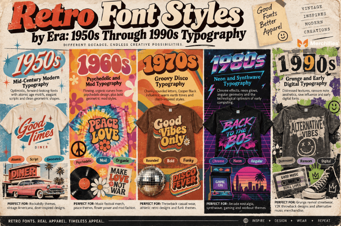
The 1960s split between two distinct movements: the flowing, organic curves of psychedelic typography and the clean geometry of mod design. Psychedelic fonts borrowed from Art Nouveau with sinuous lines, illegible but beautiful letterforms, and cramped spacing that forced viewers to slow down and engage. Mod typography took the opposite approach with bold geometric shapes and high contrast.
Music festival merchandise, peace-and-love themed designs, and flower power aesthetics call for 1960s typography. As Lucas Bennett notes, the era's fonts pair particularly well with tie-dye effects, rainbow gradients, and floral illustrations because these visual elements emerged from the same cultural moment. Font Squirrel hosts many free options suitable for commercial use, though always verify licensing before producing items for sale.
The 1970s produced some of the most recognizable retro fonts still in heavy rotation today, dominated by chunky rounded letters, Cooper Black influence, and warm earth-tone palettes. Disco ball sparkle, funk band logos, and variety show title cards all drew from this typography tradition.
This era remains the most consistently popular for throwback apparel because the fonts balance readability with personality. The rounded forms print cleanly at various sizes while still communicating unmistakable 1970s energy. Merchifies carries retro-inspired designs featuring this era's typography for designers seeking real-world application examples.
For more detailed exploration of this specific decade, our guide to 70s retro font styles that bring groovy vibes to your designs covers additional font recommendations and pairing strategies.
The 1980s introduced chrome effects, neon glows, angular geometry, and the technological optimism of early computing to typography design. Grid-based letterforms, gradient fills from pink to cyan, and perspective effects that made flat letters appear three-dimensional characterize this decade.
Arcade nostalgia, synthwave music scenes, and workout retro themes demand 1980s typography. The era works particularly well for gaming-related apparel and vaporwave aesthetics that remain popular among younger demographics discovering this decade secondhand. Our retro game fonts guide explores pixel-perfect typography options for nostalgic arcade designs.
The 1990s brought typography rebellion through distressed textures, ransom note aesthetics mixing multiple fonts, and rave culture influence with its aggressive angles and neon accents. Early digital fonts also emerged, some deliberately crude and others exploring what computers could newly accomplish.
This era increasingly resonates with younger shoppers experiencing 1990s nostalgia for a decade they barely remember or only know through media. Grunge revival streetwear, Y2K throwback designs, and alternative music merchandise benefit from this decade's typography. The deliberately imperfect aesthetic suits distressed printing techniques well.
Selecting retro fonts requires matching the font era to your design theme, testing legibility at actual print sizes, and verifying the font performs well with your chosen print method. Random font selection based purely on aesthetics leads to designs that feel inauthentic or technically problematic.
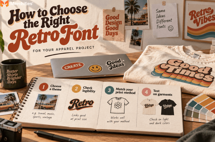
Start by identifying which era your design references. A beach party theme might suit 1960s surf culture fonts. A sports design might call for 1970s athletic lettering. A tech concept might demand 1980s digital aesthetics. Mixing eras creates visual confusion unless deliberately executed for specific effect.
Legibility requirements change dramatically based on print location. Small chest prints under four inches need cleaner, simpler fonts than large back graphics that can accommodate decorative complexity. The elaborate swashes that look stunning at twelve inches become illegible muddy marks at two inches. Always test your font at actual production size before finalizing designs.
Print method also constrains font selection. Screen printing requires fonts with stroke widths thick enough to hold ink properly. Thin hairline details may not survive the screen process. Direct-to-garment printing offers more flexibility but still struggles with extremely fine details at small sizes. When in doubt, choose bolder weights than you think necessary.
Test your selected font on both dark and light garment mockups. Retro fonts often feature warm colors that work beautifully on light fabrics but disappear on dark backgrounds. Some fonts need outline treatments or drop shadows to maintain visibility across garment color ranges.
The critical distinction for print-on-demand sellers is not whether a font costs money but whether its license explicitly permits commercial use on products sold to customers. Many free fonts restrict usage to personal projects, and using them commercially violates licensing terms regardless of whether you paid.
Trusted free sources with verified commercial licenses include Google Fonts, Font Squirrel's commercial-use section, and fonts explicitly released under the Open Font License. These resources provide professional-quality retro fonts legally cleared for product sales without royalty fees or attribution requirements.
Red flags when evaluating fonts include unclear licensing terms, no mention of commercial use, restrictive End User License Agreements, and download sites that aggregate fonts without verifying original licenses. If you cannot find explicit commercial permission, assume the font prohibits commercial use and move on to safer options.
The honest trade-off with font selection: if you want unique designs that competitors cannot easily duplicate, you will need to invest in premium fonts. You cannot fully have both maximum uniqueness and zero cost without accepting that free fonts appear in thousands of other sellers' catalogs.
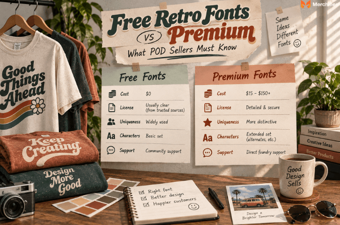
Here is how free and premium fonts compare across key factors:
Upfront cost: Free fonts with commercial licenses cost nothing, while premium fonts typically range from $15 to $150 or more depending on license scope.
License clarity: Major free font sources usually provide clear licensing documentation. Premium fonts come with detailed documentation and legal protection.
Uniqueness in marketplace: Free fonts are widely used by competitors, making differentiation difficult. Premium fonts appear less frequently, giving your designs more distinctive visual identity.
Character sets: Free fonts often include only basic Latin characters. Premium fonts typically offer extended character sets with alternates, ligatures, and special characters.
Support availability: Free fonts rely on community forums for troubleshooting. Premium fonts include direct foundry assistance when questions arise.
Always screenshot or save license documentation before using any font commercially. Licensing terms can change, websites disappear, and disputes arise years after initial download. Protecting yourself with documentation prevents expensive problems later.
Effective font pairing combines a decorative headline font with a cleaner supporting font to create visual hierarchy without competing elements fighting for attention. The headline carries personality while the supporting font provides readable information without distraction.
Era-matching creates cohesive vintage aesthetics. A 1970s decorative headline pairs naturally with a 1970s-appropriate secondary font. Mixing a 1950s script with a 1990s grunge subheadline creates jarring discontinuity unless deliberately pursuing that contrast for creative effect.
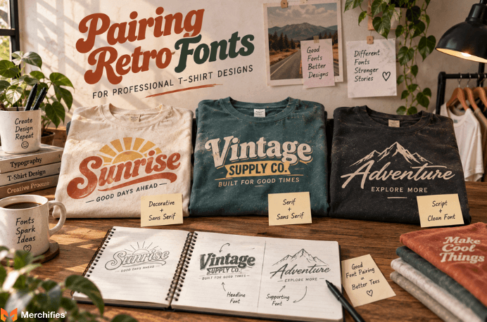
Basic pairing strategies include serif with sans-serif combinations, script with geometric combinations, and heavy with light weight combinations. The goal is sufficient contrast that each font's role remains clear while maintaining overall visual harmony. Our bold typography techniques guide covers additional pairing strategies for eye-catching graphics.
Common pairing mistakes include using two decorative fonts that compete for dominance, selecting fonts from obviously different eras without conceptual justification, and choosing pairs with insufficient contrast that blur together visually. When uncertain, simplify toward one strong decorative headline with minimal supporting text rather than multiple competing typefaces.
For designers interested in contemporary approaches alongside vintage styles, our overview of modern typography trends for custom apparel provides additional perspective on current design directions.
Successful retro typography on apparel requires converting fonts to outlines before submission, selecting era-appropriate color palettes, and considering placement strategies that enhance rather than undermine the vintage aesthetic. Technical preparation prevents problems while design choices reinforce authenticity.
Converting fonts to outlines or vectors before uploading to print-on-demand platforms eliminates licensing complications in production files. The printer does not need the original font installed because the letters become shapes rather than editable text. This practice also prevents unexpected font substitutions that can ruin designs.
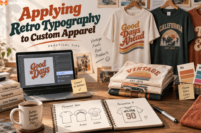
Color selection dramatically affects how vintage fonts read on finished products. Authentic retro palettes often featured muted tones, limited color ranges, and specific era signatures like 1970s earth tones or 1980s neon accents. Modern interpretations can use contemporary bright colors, but the font then reads as retro-inspired rather than authentically vintage.
Placement strategies for retro fonts often favor centered or arched text that echoes vintage sign painting and athletic lettering traditions. Left-aligned retro typography can feel mismatched because the fonts were designed for symmetrical applications. Curved text paths, banner shapes, and emblem-style lockups all complement retro typography effectively.
Personalization represents a significant opportunity for retro typography. Vintage fonts work exceptionally well for custom name and date designs because they elevate simple information into decorative statements. Reunion shirts, anniversary gifts, milestone birthdays, and commemorative apparel all benefit from retro fonts that make personal details feel special rather than generic. The customization capability of print-on-demand aligns perfectly with designs where individual names and dates transform standard fonts into meaningful keepsakes.
Browse Merchifies free shipping collection for retro-inspired custom apparel across various vintage styles, including 70s throwback designs, 80s synthwave graphics, and classic Americana themes, to find typography examples that match your design direction.
Drawing on Lucas Bennett's research into vintage-inspired custom apparel, the most successful retro typography designs commit fully to their chosen era rather than hedging with modern compromises. Authenticity resonates with buyers seeking genuine vintage aesthetics. Choose your decade, study its visual language, and execute with confidence.
-d4c38c342cdf20ca.jpeg)


-b555fcc6b204c456.jpeg)