 Worldwide Shipping
 Secure Payments
 Free Return
 Local Support
-da0801079a650a2e.jpeg)
17 Year Anniversary Quotes: 110+ Funny, Romantic & Furniture Wishes (2026)
Mar, 12 2026
Discover exactly where to put your logo on a shirt for maximum visibility and professional appeal. This guide covers measurements, use cases, and placement strategies for corporate, team, and promotional apparel.

Logo placement determines whether your shirt makes a memorable impression or gets overlooked entirely. Based on Lucas Bennett's analysis of apparel branding across corporate, team, and promotional contexts, where you put your logo on a shirt directly affects visibility, professionalism, and how effectively your design communicates its purpose. The left chest position (3-4 inches wide) remains the go-to for professional settings, while full front placement (12+ inches) creates bold visual impact for promotional events and casual wear. Understanding which zone fits your specific situation eliminates guesswork and ensures your custom shirts look intentional rather than accidental.
The highest-impact logo placements depend on your shirt's purpose:
Left chest (3-4 inches): professional, corporate, subtle branding
Full front (12+ inches): bold impact, promotional events, statement pieces
Upper back (3-4 inches below collar): team identification, secondary branding
Sleeve (2-3 inches): accent branding, sponsor logos
The most effective logo placement balances visibility with purpose—left chest for professional restraint, full front for maximum attention, and back placements for team identification. These three zones handle roughly 80% of all custom shirt orders because they work across nearly every context and body type. The remaining placements—sleeves, hems, and pocket areas—serve as accent positions that complement rather than replace primary zones.

Visual hierarchy explains why certain placements grab attention before others. Human eyes naturally scan from the upper chest outward, making left chest logos one of the first elements noticed during conversation. Full front designs command attention from across a room, which is exactly why promotional and event shirts favor this placement. Back placements catch eyes when someone walks away—useful for team shirts where you want identification from all angles.
Before choosing where to put your logo on a shirt, consider three factors: your audience (professional contacts vs casual observers), the shirt's primary context (office vs outdoor event vs sports field), and the message intensity you want to convey (subtle brand presence vs bold statement). The sections that follow break down each major placement zone with exact measurements, use case recommendations, and practical guidelines for making your design work.
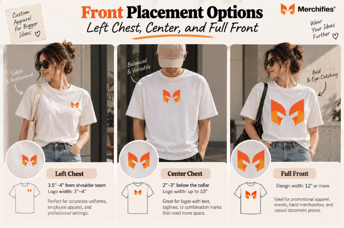
Left chest placement positions your logo 3.5-4 inches from the shoulder seam with a logo width of 3-4 inches—the industry standard for professional and corporate apparel. This measurement, established through SGIA and PRINTING United printing standards, ensures the logo sits visibly without overwhelming the shirt's overall appearance. For corporate uniforms, employee apparel, and business casual contexts, left chest placement signals professionalism while keeping your brand visible during handshakes and conversations.
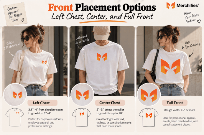
Center chest placement works best for logos that include text or need balanced presentation. Position the top of your design 2-3 inches below the collar, keeping the width under 10 inches for standard sizing. This placement offers more canvas than left chest while maintaining a cleaner look than full front designs. Company logos with taglines, event names with dates, and combination marks (symbol plus wordmark) often perform best in this centered position.
Full front placement delivers maximum visual impact with designs spanning 12 inches or more. This zone dominates promotional apparel, band merchandise, and casual statement pieces where subtlety takes a back seat to visibility. As Lucas Bennett notes, promotional giveaways at trade shows and community events benefit from full front placement because these shirts need to communicate quickly to people who might see them for only a few seconds. The honest trade-off with full front designs: they read as casual rather than professional, making them less appropriate for corporate or formal settings. You cannot achieve maximum visual impact while maintaining subtle professionalism—choose the priority that matches your context.
When choosing between these three front positions, match the placement to your primary use case. Left chest handles corporate uniforms and professional settings. Center chest balances visibility with restraint for logos that need room to breathe. Full front maximizes impact for promotional, casual, and statement applications where you want your design noticed immediately.
Upper back placement—positioned 3-4 inches below the collar—serves team identification better than any other zone, making it essential for sports apparel, group events, and coordinated uniforms. This position ensures visibility when team members face away, which happens constantly during games, events, and group activities. Names and numbers placed here become instantly recognizable from bleachers, sidelines, and across crowded venues.
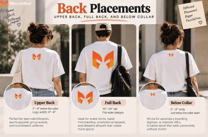
Full back designs spanning 10-14 inches vertically create the large-format impact seen on event shirts, band merchandise, and promotional apparel. This placement handles complex graphics, detailed artwork, and designs that need significant real estate to communicate effectively. Concert merchandise and festival shirts almost universally use full back placement because attendees become walking billboards in crowds. The trade-off here involves cost: full back designs add expense to most print orders and require more setup time, so factor this into your budget for larger quantities.
Below-collar placement (also called nape placement) positions small logos or taglines 2-3 inches wide just below the collar seam. This subtle zone works for secondary branding—a small brand mark that appears when someone sees the shirt from behind without competing with a primary front logo. Corporate apparel sometimes uses this position for taglines or website URLs, adding a detail that rewards closer inspection without cluttering the main design areas.
Looking for creative back design ideas? Our guide to what to put on the back of a team shirt covers design inspiration and layout strategies specifically for group orders and team apparel.
Team shirts benefit most from combining back placement with front logos. A left chest logo on the front paired with a back name and number creates complete identification from all angles—the approach used by virtually every organized sports team, from youth leagues to professional franchises.
Sleeve placement positions logos 1-2 inches below the shoulder seam with a typical width of 2-3 inches, serving as secondary branding for sponsor logos, accent marks, and layered brand strategies. This zone supplements rather than replaces primary placements. Corporate apparel might feature a company logo on the left chest with a division or department mark on the sleeve. Sponsored event shirts often reserve sleeve positions for secondary sponsors while primary sponsors claim front or back real estate.
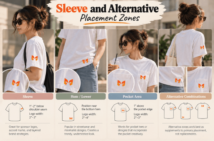
Hip and hem placement appeals to streetwear aesthetics and minimalist design sensibilities. Positioning a small logo (2-4 inches) near the bottom hem creates a trendy, understated look that works for casual lifestyle apparel. This placement appears frequently on fashion-forward basics where overt branding would undermine the aesthetic. The positioning feels intentional and modern rather than promotional.
Pocket area placement requires careful measurement to avoid awkward overlap. For pocket tees, position your logo 1 inch above the pocket edge or incorporate the pocket itself as a design element. Some designs place a small graphic partially emerging from the pocket—a playful approach that works for casual and novelty apparel. Alignment matters here: a logo that slightly overlaps a pocket edge looks accidental rather than intentional.
Alternative zones work best as supplements to primary placement, not replacements. A sleeve logo paired with a front chest logo creates layered branding. A hem mark adds subtle detail to a full front design. Stacking multiple alternative placements without a primary position, however, confuses the visual hierarchy and makes shirts look unfocused. Choose one primary placement first, then consider whether an alternative zone adds value or just adds clutter.
Matching placement to purpose eliminates the guesswork that leads to poorly positioned logos—corporate shirts need different treatment than team uniforms or promotional giveaways. Understanding how each use case aligns with specific placement zones helps you make confident decisions for any custom shirt project.
Professional settings demand restraint. Left chest placement with conservative 3-4 inch sizing maintains professionalism across all employee interactions. This combination works whether your staff meets clients in conference rooms or represents your brand at industry events. The uniformity signals organization and attention to detail—qualities clients and partners notice even when they cannot articulate why. Optional back logo placement can add secondary branding without compromising the professional front presentation.
Team shirts require identification from multiple angles. A 3-4 inch front chest logo establishes team identity during face-to-face interactions, while back name and number combinations (10-12 inch height typical) ensure recognition during play or group activities. This dual-placement approach has been standard in organized sports for decades because it solves the fundamental problem of identifying people who are constantly moving and facing different directions. Merchifies carries custom logo printing on quality tees designed for exactly these team apparel purposes.
Promotional shirts prioritize visibility over subtlety. Full front placement (12+ inches) ensures your message gets noticed in crowded venues where people might see your shirt for only moments. Event details on the back—date, location, hashtag—turn attendees into walking advertisements that communicate even when facing away. Trade show giveaways, charity walk shirts, and community event apparel all benefit from this high-visibility approach.
Casual contexts offer creative freedom that professional settings restrict. Oversized prints, alternative placements, and unconventional sizing all work when the primary goal is personal expression rather than corporate identity. Fashion-forward basics might feature minimal hem branding. Statement pieces might use full front designs that would overwhelm corporate settings. Match the placement to the intended context rather than defaulting to safe choices.
Your print method constrains which placements work technically—screen printing handles standard zones efficiently, while DTG offers flexibility within defined print areas, and embroidery works best for smaller left chest designs. Understanding these constraints before finalizing placement prevents the frustration of discovering your chosen position cannot accommodate your design.
Screen printing excels at standard placements and handles high-volume orders efficiently. Left chest, center chest, full front, and back placements all work well with screen printing. The process becomes cost-effective at higher quantities because setup costs spread across more units. For orders exceeding 24 pieces with straightforward placement, screen printing typically offers the best per-unit pricing.
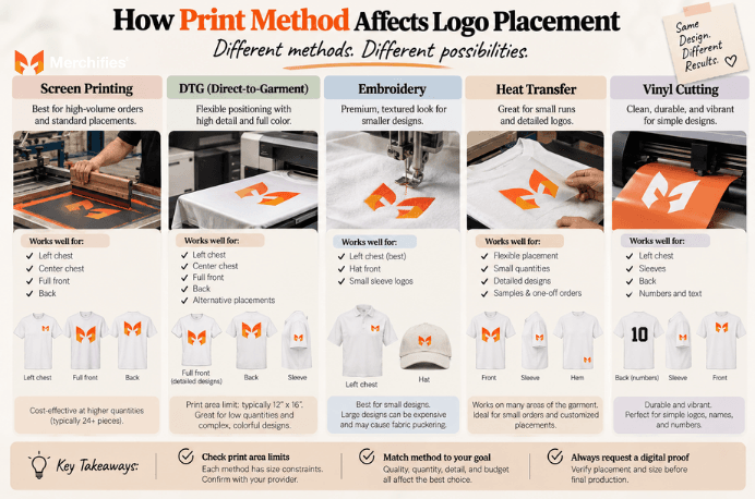
DTG (direct-to-garment) printing offers flexible positioning but operates within defined print area limits—typically 12x16 inches maximum on most equipment. This print area accommodates full front designs and standard back placements but may constrain oversized graphics. DTG works particularly well for lower quantities (under 24 pieces) and designs with many colors or photographic elements that would require numerous screens in traditional printing. DTG has become the preferred method for print-on-demand operations specifically because it handles variable orders and diverse designs that custom apparel services require.
Embroidery creates a premium, textured appearance but introduces limitations that screen printing and DTG avoid. Left chest placement dominates embroidered apparel because the technique works best at smaller scales. Large full-front embroidery designs risk fabric puckering, especially on thinner materials, and the per-stitch pricing makes oversized designs expensive. Embroidery excels for corporate polo shirts, hats, and professional apparel where the raised texture signals quality.
Heat transfer and vinyl cutting work well for small-quantity orders and detailed logos. Placement flexibility runs high with these methods since equipment can apply designs nearly anywhere on the garment. The per-unit cost makes sense for small runs, samples, and single-piece orders that would be prohibitively expensive to screen print.
POD-specific considerations deserve attention here. Print area constraints vary by supplier, and what works with one provider might not work with another. Always preview your design placement before ordering to confirm the final result matches your expectations. Digital proofs showing exact placement should be standard practice regardless of your print provider—request one before final production approval.
Shirt style affects optimal placement measurements—V-necks require adjustment upward, pocket tees demand clearance consideration, and performance fabrics introduce stretch complications that basic cotton does not present. Ignoring these variations leads to logos that look misaligned, awkwardly positioned, or distorted during wear.
V-neck shirts require adjusting center chest placement up 0.5-1 inch to avoid the neckline encroaching on your design. The V-cut creates visual conflict if a logo sits too close, making the design feel cramped rather than intentionally placed. Left chest placement typically needs no adjustment on V-necks since the neckline does not extend toward that zone.
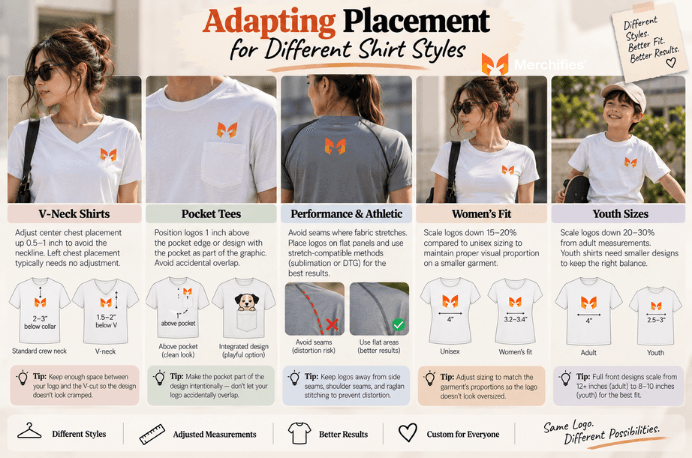
Pocket tees demand careful placement to avoid the awkward overlap that signals poor planning. Position logos 1 inch above the pocket edge for clean visual separation. Alternatively, design with the pocket as an intentional element—graphics that appear to emerge from the pocket or interact with its shape can look playful rather than accidental. The key distinction: intentional integration versus unplanned overlap.
Performance and athletic fabrics introduce stretch considerations that cotton does not present. Logos placed directly over seams may distort during movement as the fabric flexes. Side seams, shoulder seams, and raglan construction all create potential distortion zones. Position logos on flat fabric panels away from seams when possible, and request stretch-compatible print methods (sublimation or DTG typically) for performance materials.
Women's fit versus unisex sizing requires scaling adjustments. Women's fitted styles typically need logos scaled down 15-20% from unisex measurements. A 4-inch left chest logo on a unisex tee becomes a 3.2-3.4 inch logo on a women's fitted version. This scaling maintains visual proportion—the same absolute size logo looks larger on a smaller garment.
Youth sizes require more aggressive scaling, typically 20-30% reduction from adult measurements. A 4-inch adult left chest logo becomes 2.5-3 inches on youth sizes. Youth full front designs scale from 12+ inches to 8-10 inches. Without this adjustment, youth shirts look overwhelmed by logos sized for adult proportions.
Poor placement undermines even well-designed logos—positioning too low, oversizing for the zone, and ignoring garment details all create results that look amateur rather than professional. These mistakes appear frequently because they feel minor during design but become obvious once shirts are printed and worn.
Placing logos too low on the chest makes designs look like afterthoughts rather than intentional placements. Left chest logos should sit 3.5-4 inches from the shoulder seam—any lower and they drift toward the mid-torso where they create awkward visual balance. Center chest designs positioned below the sternum similarly lose impact and appear to slide down the shirt.
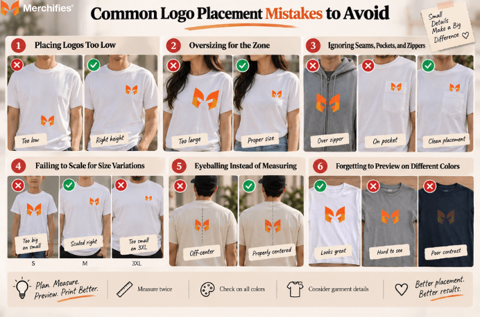
Oversizing for the placement zone overwhelms the garment and signals inexperience. Left chest logos exceeding 4.5 inches look unbalanced on standard adult shirts. The zone exists to provide subtle, professional presence—pushing beyond its natural limits defeats the purpose. If your design needs more space, move to center chest or full front rather than forcing an oversized logo into a restraint-oriented zone.
Ignoring seams, pockets, and zippers creates printing complications and visual distortion. Logos placed across zippered hoodies often get split by the zipper line. Designs crossing side seams may distort during printing or appear misaligned when worn. Survey the garment's construction features before finalizing placement, and position logos on flat, uninterrupted fabric panels whenever possible.
Failing to scale for size variations creates inconsistency across your order. The same 4-inch logo that looks proportional on a medium shirt overwhelms a small and gets lost on a 3XL. Professional print services adjust scaling across sizes, but you need to specify this requirement—it is not always automatic. Request size-adaptive scaling for orders spanning multiple sizes.
Eyeballing placement instead of measuring creates centering errors visible in the final product. Always measure from seams (shoulder seam, side seam, collar seam) rather than estimating by sight. Use a ruler, placement template, or the grid tools in your design software. What looks centered on screen often prints off-center when translated to physical garments without precise measurement.
Forgetting to preview on multiple shirt colors causes visibility problems discovered only after printing. A logo that pops on a white shirt may disappear on heather gray or become illegible on dark navy. Preview your design on the actual shirt colors you plan to order, adjusting logo colors as needed for contrast and readability across your color range.
Successful custom shirt orders start with proper file preparation and end with careful proofing—shortcuts at either stage lead to disappointing results that require reprinting at your expense. The process involves more than uploading a file and selecting a placement, though quality print services simplify these steps considerably.
File format requirements favor vector graphics (AI, EPS, SVG) that scale crisply to any size without losing quality. Vector files contain mathematical descriptions of shapes rather than fixed pixel grids, allowing logos to enlarge for full back placement or shrink for sleeve positioning without blurring or pixelation. When vector files are unavailable, high-resolution PNG files (300 DPI minimum) serve as acceptable backups for most print methods.
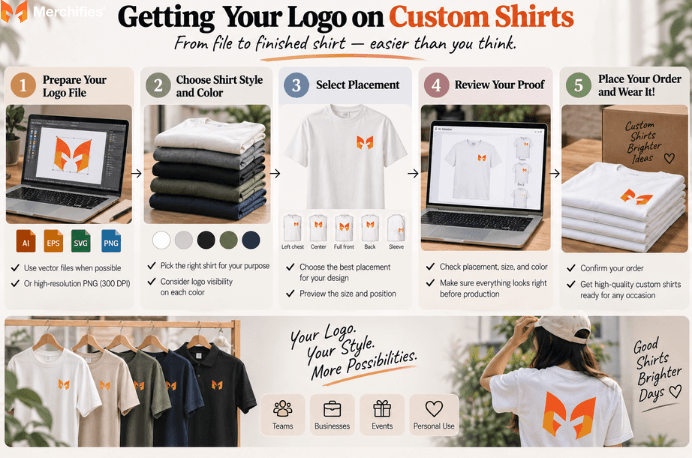
Color considerations affect visibility and production. Dark logos on light shirts and light or bright logos on dark shirts ensure readability. Logos designed for one background color may need adjustment for others—a logo that works on white may need a color shift or outline to remain visible on black. Match your logo colors to your planned shirt colors before ordering, especially if your design relies on subtle color variations.
The ordering process should include placement selection at the design stage and digital proof review before production approval. Quality print services provide proofs showing exactly where your logo will print on the garment. Review these proofs carefully—catching a placement error at the proof stage costs nothing, while catching it after printing costs the entire order.
Drawing on Lucas Bennett's work with custom apparel, the simplest path from logo concept to printed shirt involves services that handle the technical complexity while giving you control over design decisions. Merchifies makes custom logo shirt creation straightforward: upload your logo, select your placement, preview your design, and order quality custom logo t-shirts, team apparel, or corporate branded shirts. Browse our custom apparel collection —including performance tees, classic cotton basics, and professional polo options—to find the style that matches your placement strategy and intended use.
-d4c38c342cdf20ca.jpeg)


-b555fcc6b204c456.jpeg)