 Worldwide Shipping
 Secure Payments
 Free Return
 Local Support
-da0801079a650a2e.jpeg)
17 Year Anniversary Quotes: 110+ Funny, Romantic & Furniture Wishes (2026)
Mar, 12 2026
Looking for back of shirt designs that make your team stand out? This guide covers creative ideas for sports, corporate, and event teams plus practical tips for sizing, placement, and avoiding common mistakes.
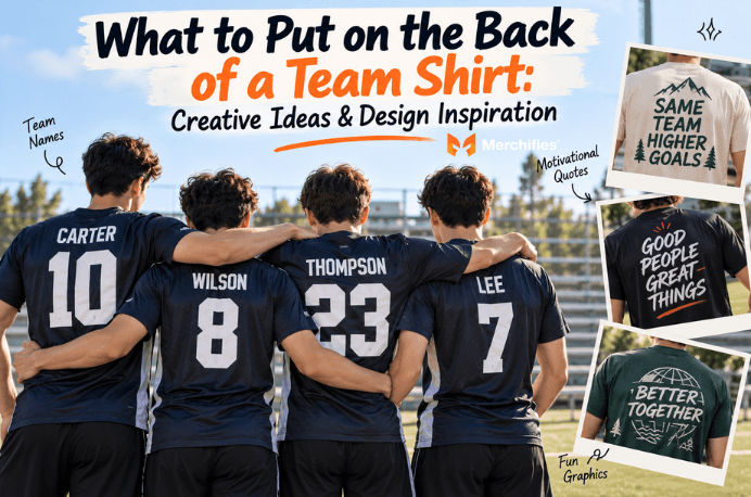
Based on Lucas Bennett's research into custom apparel trends, the back of your team shirt carries more visual weight than most organizers realize. That rear panel creates a walking billboard effect, visible from sidelines, in group photos, and whenever your team moves together through a crowd. Yet many groups treat back of shirt designs as an afterthought, missing half their shirt's potential impact. As of fall 2026, teams that invest thought into their back designs consistently report stronger unity and better recognition at events.
The back of a team shirt serves as your largest design canvas and most visible branding opportunity when groups move together.
Back designs stay visible when teammates face the same direction
Larger space allows bolder graphics than front placement
Names and numbers personalize each member's experience
Back designs photograph well in group shots from behind
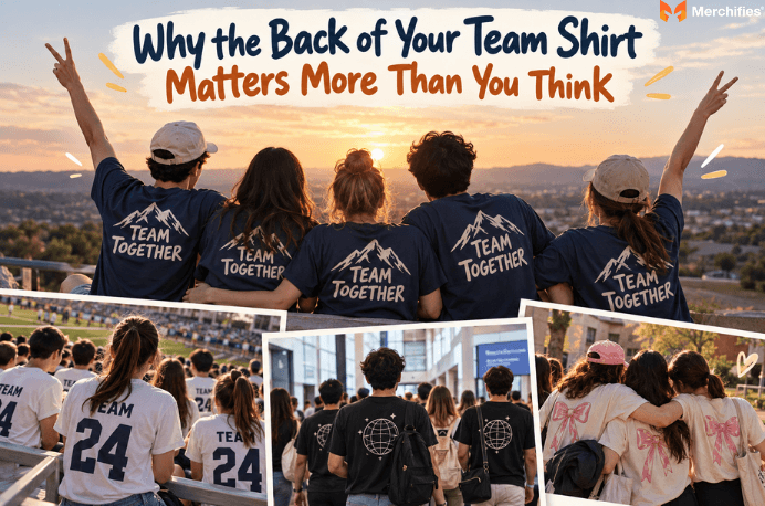
Back of shirt designs create walking visibility that front designs simply cannot match. When your team sits in bleachers, walks through a conference, or gathers for a photo, viewers primarily see backs. That rear panel becomes your primary brand surface in these common scenarios.
The psychological impact runs deeper than simple visibility. When every team member wears the same back design, facing the same direction, it signals unity and belonging in a way that front-only designs cannot replicate. You feel part of something larger when you look around and see matching backs.
Consider the practical canvas advantage: most team shirt backs offer 10 to 14 inches of printable width, compared to 8 to 10 inches on fronts where pocket placement and neckline trim reduce usable space. This larger area allows for more impactful graphics, longer text, or combinations that would look cramped on the front. Sports teams have understood this for decades, which explains why jerseys worldwide feature names and numbers prominently on backs.
Teams that skip back designs miss a significant opportunity. Your front design works when people face you directly, but backs dominate group settings, crowd navigation, and event photography. A thoughtful back design transforms your team from people in matching shirts to a cohesive unit with clear identity.
Four foundational elements form the backbone of effective back of shirt designs: names, numbers, text, and graphics. These classic approaches have proven themselves across sports leagues, corporate retreats, and community events for good reason. Each element serves different purposes and suits different team contexts.
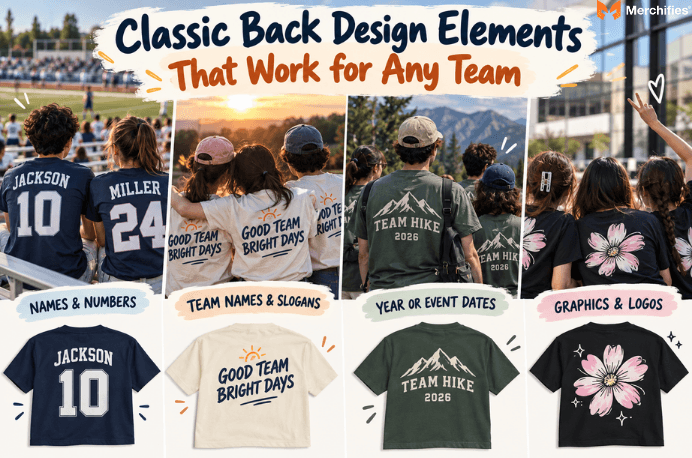
Names and numbers remain the most personalized option, giving each team member individual identity within the group. This approach works particularly well for ongoing teams with stable rosters, where members wear shirts repeatedly throughout a season or year. The personalization creates ownership, and teammates often keep these shirts as meaningful keepsakes long after the event ends. The key consideration here is that this requires individual customization per shirt, adding complexity to your order.
Team names and slogans prioritize group identity over individual recognition. A bold team name across the upper back creates instant recognition from distance, making it ideal for tournament settings where quick identification matters. Slogans can capture team philosophy, inside jokes, or motivational messages that reinforce shared values every time members put on their shirts. For this approach, text must be readable from 15 feet or more away.
Year or event dates commemorate specific occasions, turning team shirts into wearable souvenirs. Reunion groups, tournament teams, and anniversary celebrations benefit from prominent date placement. This element pairs well with other design components and adds commemorative value without overwhelming the overall look.
Graphics and logos offer the boldest visual impact, working across all team types when designed appropriately for the shirt color and print method. The honest trade-off: graphics require high-resolution source files and careful color matching, but they deliver the strongest visual punch from a distance.
Sports teams have the richest tradition of back of shirt designs, offering proven templates and room for creative variations. While traditional name-and-number jerseys dominate professional sports, recreational and amateur teams can push creative boundaries that pros cannot.
Player nicknames instead of legal names inject personality into casual leagues. Your Wednesday night softball team might feature Slugger or The Wall instead of Johnson and Martinez. This approach works especially well for adult recreational leagues where the atmosphere prioritizes fun over formality.
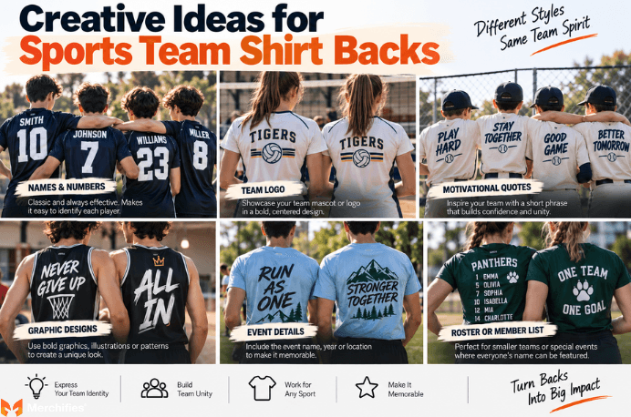
Position-specific graphics add visual interest while communicating player roles. A goalkeeper might wear a different back design than field players, or a designated hitter could sport a unique graphic element. As Lucas Bennett notes, this subtle differentiation helps spectators and teammates identify roles at a glance while maintaining team unity.
Motivational phrases that capture team philosophy transform backs into message boards. Phrases like Leave Nothing or One Team One Dream reinforce shared values during practices and games. Championship years or tournament bracket graphics commemorate achievements, though this works best after the accomplishment rather than as hopeful prediction.
Inside jokes and team mantras only members understand create exclusive belonging. When your team shares a laugh every time someone notices the back design, you have built something meaningful that strengthens bonds. Consider phrases from memorable team moments, coach quotes that became running jokes, or references to team traditions that newcomers learn to appreciate. Merchifies carries sports-oriented tee styles in athletic cuts and moisture-wicking fabrics suited for active teams.
Corporate team shirts require a different approach than sports gear, balancing professionalism with approachability. Work teams often search for back of shirt designs that represent their organization without looking like walking advertisements or sacrificing the casual nature of team apparel.
Department or role titles work well for company events where multiple teams gather. Engineering, Sales, and Operations teams wearing different role identifiers create easy networking opportunities while maintaining unified company branding. This approach helps event attendees find relevant colleagues in crowded settings.
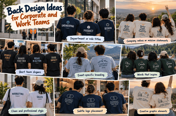
Company values or mission statement excerpts turn shirts into cultural reinforcement tools. A nonprofit team wearing their mission statement creates conversation starters at charity events. Corporate retreat shirts might feature a single word that captures the year's theme or a brief phrase that summarizes strategic priorities.
Event-specific branding distinguishes particular occasions from general company gear. Conference shirts, charity walk apparel, and team-building retreat gear each deserve unique back treatments that commemorate the specific experience.
QR codes linking to company pages or campaign microsites add interactive elements, though placement must ensure scannability without awkward positioning. Subtle logo placement suits professional settings where understated branding matters more than bold statements. A small logo in the upper back corner, perhaps 3 to 4 inches wide, signals company affiliation without overwhelming the design or making wearers feel like human billboards during after-hours wear.
Event groups and reunion organizers face unique challenges with back of shirt designs that differ from ongoing teams. These shirts often serve as both event identifier and lasting souvenir, requiring designs that work during the event and remain meaningful afterward.
Bachelorette and bachelor party shirts thrive on creativity with role designations and nicknames. The wedding party might feature each person's relationship to the couple like Maid of Honor, College Roommate, or Work Wife. Humorous nicknames that commemorate the friendship also work well. These one-time-use shirts can push boundaries that professional or sports contexts would not allow.
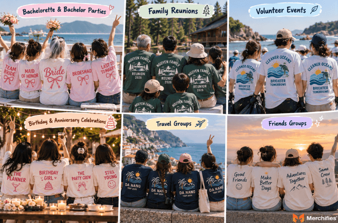
Family reunion shirts benefit from generational connections or location-based themes. A family tree graphic with branch names, a map highlighting where family members have settled, or the reunion location with dates creates lasting keepsakes. Multi-generation events might include birth year ranges like The 1990s Generation to celebrate age diversity within the family.
Volunteer event shirts should prominently feature cause-related messaging that helps wearers serve as ambassadors during and after the event. A beach cleanup crew wearing Protecting Our Coastline Since 2024 identifies their purpose to observers and sparks conservation conversations.
Birthday and anniversary celebration shirts commemorate specific honorees with photos, quotes, or milestone achievements. Travel group shirts featuring destination names, trip dates, or itinerary highlights transform vacation apparel into wearable memory books that prompt storytelling for years afterward.
Proper placement and sizing separate professional-looking back of shirt designs from amateur attempts. Technical considerations that seem minor on screen become obvious problems on physical garments, making this guidance essential for first-time designers.
The upper back zone sits 2 to 4 inches below the neckline. This position works best for team names and short text that should remain visible even when someone wears a backpack or sits in a chair. Think of this as your headline space.
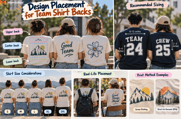
Center back placement falls 6 to 10 inches below the neckline. This area offers maximum visibility and works for primary graphics or main design elements. Most people notice this zone first when viewing from behind.
Lower back placement carries more risk. Elements placed here often get tucked into waistbands or hidden by belts, so reserve this area only for secondary elements that complement the main design above.
Recommended dimensions for readability depend on viewing distance and design complexity. Most team contexts require visibility from 15 to 25 feet, suggesting minimum widths of 8 to 12 inches for primary elements. Names and numbers should use fonts at least 2 inches tall for reasonable distance readability, with 3 to 4 inch letters preferred for outdoor venues or large event spaces.
Bleed considerations vary by print method. Screen printing requires clean edges with no gradients touching design boundaries, while direct-to-garment printing handles photographic elements and gradients more forgivingly. Understanding your print method before finalizing designs prevents costly surprises.
Shirt size significantly affects design appearance. A design that looks proportional on a medium shirt may appear cramped on 2XL or overwhelmingly large on small. Request mockups across your full size range, or test print on the smallest and largest sizes you will order.
Understanding common failures helps teams avoid wasted money and disappointing results. These mistakes appear repeatedly in team shirt projects, yet remain entirely preventable with advance awareness.
Too many competing elements create visual chaos that undermines every individual component. Teams often want to include their name, logo, slogan, year, sponsor, and individual personalization all on the back. The result overwhelms viewers and nothing communicates effectively. Limit back designs to two or three core elements maximum, prioritizing the single most important message.
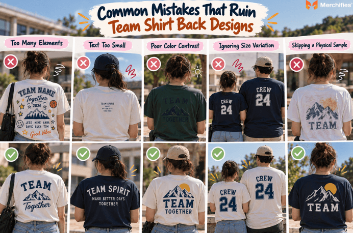
Text too small for actual viewing conditions plagues amateur designs. What reads clearly on a computer screen becomes illegible from across a gym or field. Always test text readability from the actual distances your team will be viewed, not just arm's length.
Color conflicts between design and fabric create readability disasters. Dark graphics on dark shirts, light text on white fabric, and colors that blend rather than contrast waste your design investment. Always view digital mockups on the actual shirt color before ordering, and consider how designs will appear under various lighting conditions.
Forgetting body size variation leads to inconsistent team appearance. A design optimized for medium shirts looks different on every size, and teams with size ranges from small to 3XL will show visible variation. Design with proportional flexibility in mind, or accept that some size-related variation will occur.
Ordering without physical proof invites disaster. Digital mockups approximate but never perfectly represent final products. Request physical samples before full team orders, especially for complex designs, unusual colors, or first-time vendors. The sample cost is minimal compared to reprinting an entire team's worth of disappointing shirts.
Selecting the right back design approach requires matching your choice to team context, budget, and longevity goals. This decision framework helps teams move past endless debates toward clear choices that serve their specific needs.
Names and numbers fit best for ongoing teams with consistent rosters where individual recognition matters. Sports leagues with regular seasons, school groups that meet weekly, and performance ensembles benefit from personalization that builds individual ownership within team identity. The honest trade-off: individual customization costs more per shirt and requires accurate name lists before ordering, but creates significantly stronger personal connection. You cannot get deep personalization without paying more and planning further ahead.
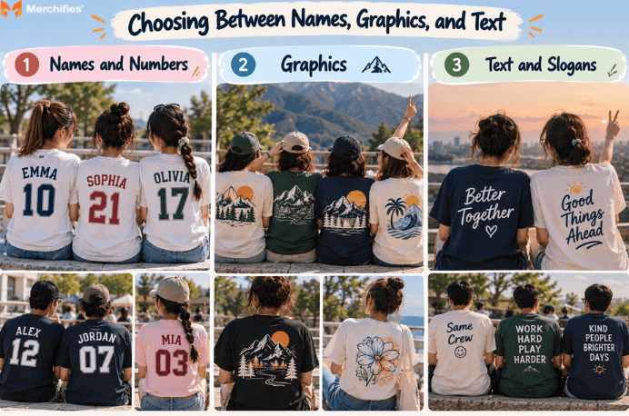
Graphics fit best for one-time events or teams prioritizing visual brand impact over individual recognition. A bold graphic creates unified visual presence without the complexity of managing individual personalization. Event teams, promotional groups, and brand-focused organizations often find graphics deliver more impact with less coordination overhead.
Text and slogans fit best for message-driven causes or teams emphasizing shared culture over individual or visual elements. Nonprofits, advocacy groups, and teams built around particular values benefit from text that literally states their purpose. Well-chosen words become conversation starters and reinforce team values every time members dress.
Budget factors into this framework significantly. Individual names require per-shirt customization that increases costs, sometimes substantially for small orders. Generic graphics and text-based designs cost the same regardless of order quantity, making them more budget-friendly for price-sensitive teams.
Longevity also matters. Generic backs remain wearable and relevant for years, even as team rosters change. Personalized backs become treasured keepsakes but lose practical value when members leave. Consider whether your shirts should serve as ongoing team uniforms or commemorative items for specific moments.
Translating creative ideas into actual shirts requires practical steps that move from concept to finished product. This process framework helps organizers navigate from inspiration to delivery without common pitfalls.
Start with purpose by asking what teammates should feel wearing this shirt. Pride? Belonging? Fun? Professional identity? The emotional goal shapes every subsequent decision, from design complexity to color choices to text content. Teams that skip this clarifying question often end up with designs that technically look fine but fail to resonate emotionally.
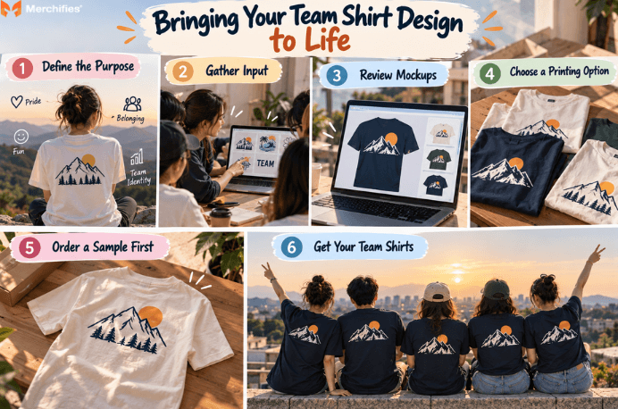
Gather input from team members early to build buy-in and surface creative ideas you would not generate alone. A quick poll on design preferences, a brainstorming session for slogan ideas, or simply asking what elements matter most creates ownership that extends beyond the designated organizer. Teams that receive shirts without input often feel less connected than those who contributed to the design process.
Use mockup tools to visualize designs before committing. Most print services offer free digital mockups that show designs on actual shirt templates across multiple colors. Review these mockups carefully, share them with stakeholders, and request revisions before approval. Digital review catches problems that would be expensive to fix after printing.
Print-on-demand services simplify custom orders with individual personalization, allowing different names and numbers on each shirt without bulk minimums. This approach particularly suits teams with varied sizing needs or those wanting personalized backs without traditional bulk-order constraints.
The POD advantage extends to testing and iteration. Order a single sample shirt to verify colors, placement, and print quality before committing to team quantities. This proof step catches issues that mockups miss, including fabric texture effects, color accuracy under real lighting, and actual size proportions.
Drawing on Lucas Bennett's work with team apparel design, the most successful teams treat their back of shirt designs as intentional branding decisions rather than afterthoughts. Browse the Merchifies collection to find styles that match your team's needs, from athletic cuts to relaxed fits, with back-of-shirt customization built into the ordering process.
-d4c38c342cdf20ca.jpeg)


-b555fcc6b204c456.jpeg)