 Worldwide Shipping
 Secure Payments
 Free Return
 Local Support
-da0801079a650a2e.jpeg)
17 Year Anniversary Quotes: 110+ Funny, Romantic & Furniture Wishes (2026)
Mar, 12 2026
Discover what makes 70s retro fonts authentically groovy and learn which substyles work best for your t-shirt designs. From disco shimmer to psychedelic curves, find the perfect vintage typography for custom apparel.
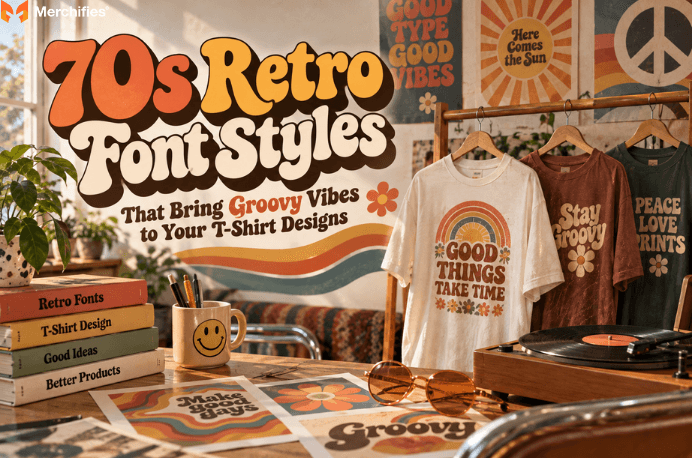
Based on Lucas Bennett's research into vintage typography for apparel, the 70s retro font category encompasses several distinct substyles—each carrying different visual weight, cultural associations, and practical applications for t-shirt printing. Understanding these differences separates designers who capture authentic vintage energy from those who simply slap any old-looking font onto fabric and hope for the best. The decade produced typography that ranged from glittering disco display faces to mind-bending psychedelic letterforms, and each substyle communicates something specific to the person wearing your design.
As of fall 2026, 70s-inspired apparel continues dominating vintage fashion trends, but most designers struggle to articulate why certain fonts feel genuinely retro while others fall flat. The answer lies in understanding the visual DNA of the era—rounded corners, exaggerated curves, and a particular kind of optimistic energy that defined everything from album covers to supermarket signage.
Quick Answer: What defines authentic 70s retro font style?
Rounded corners and flowing curves replace sharp angles
Exaggerated letterforms with thick-to-thin stroke variation
Cultural markers from disco, funk, and counterculture movements
Optimistic, forward-looking energy translated through type
Authentic 70s retro typography shares specific visual characteristics that distinguish it from generic vintage fonts or decade-adjacent styles. The core markers include rounded corners that soften what would otherwise be geometric shapes, flowing curves that suggest movement rather than rigidity, and exaggerated letterforms that prioritize personality over pure legibility. These fonts look like they want to dance.
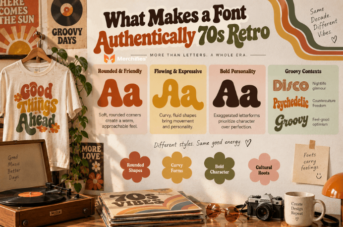
The thick-to-thin stroke variation common in 70s typography creates visual rhythm within individual letters. Compare this to the uniform stroke weights of 60s modernism or the angular precision of 80s new wave—the 70s sat comfortably between these eras, borrowing the optimism of mid-century design while adding organic warmth that felt more human and approachable.
Cultural context matters when selecting 70s fonts for t-shirt designs. Disco typography emerged from nightclub culture—think Studio 54 glamour, chrome reflections, and geometric precision that still managed to feel celebratory rather than cold. Psychedelic fonts grew from counterculture movements, concert posters, and album art that prioritized visual experience over commercial readability. Groovy scripts captured the casual, feel-good optimism that permeated mainstream 70s advertising and lifestyle branding.
Why do these characteristics translate effectively to vintage t-shirt designs? Because the 70s retro font aesthetic carries emotional weight that viewers recognize even without conscious analysis. When someone sees properly executed 70s typography on a shirt, they don't just see letters—they feel a specific era, a particular cultural moment, an attitude that resonates across decades.
The honest trade-off: if you want maximum 70s authenticity, you may need to sacrifice some modern readability conventions. Period-accurate psychedelic fonts prioritize visual impact over quick comprehension. You cannot fully have both extreme stylization and instant legibility without adjusting either the font complexity or the print size.
Generic retro fonts—the kind that appear in free font bundles labeled simply as "vintage"—often lack these specific era markers. They might look old without looking specifically 70s. For t-shirt designs meant to evoke authentic nostalgia, specificity matters more than vague vintage vibes.
Disco fonts combine geometric precision with glamorous details like inline effects, chrome textures, and mirror-ball reflections that capture the nightlife energy of the late 1970s. These display faces work best at larger sizes where their intricate details remain visible and their celebratory energy dominates the design.
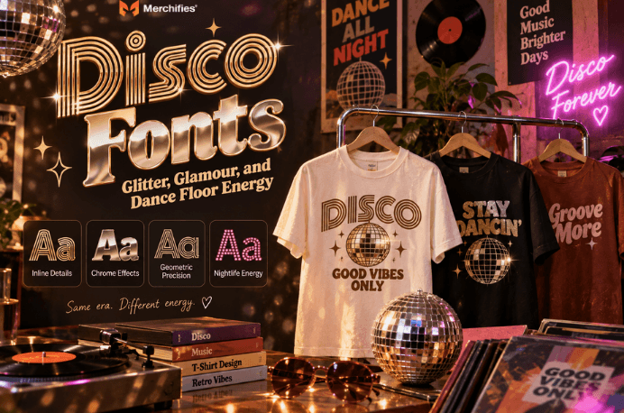
The visual characteristics that define disco typography include inline details—thin lines running through the center of letterforms that suggest light reflecting off metallic surfaces. Chrome and metallic effects create the illusion of dimensional, reflective type. Geometric precision grounds these fonts in the era's sleek, futuristic optimism while the decorative details add the warmth and glamour that separated disco from cold modernism.
When searching for disco-style 70s retro fonts, use specific style terms: "disco inline," "chrome retro," "70s geometric display," or "metallic disco font." These descriptors help you find fonts with the right characteristics rather than scrolling through hundreds of vaguely retro options.
Best t-shirt applications for disco fonts include party themes, music-related designs, nightlife and celebration apparel, and any design meant to capture celebratory energy. A disco font on a birthday shirt says something different than a disco font on a corporate polo—the context should match the font's inherent personality.
Color pairings that amplify disco energy include metallics (gold, silver, copper), bold purples, electric blues, and mirror-ball silver. These colors reference the visual vocabulary of disco culture—the reflective surfaces, the dramatic lighting, the unapologetic glamour. On darker t-shirt bases, metallic inks can approximate the chrome effect that makes disco typography distinctive.
The limitations of disco fonts center on their complexity. Those inline details that look spectacular at 3 inches tall may disappear entirely at 1 inch. Plan your print dimensions before committing to intricate disco typography.
Psychedelic fonts feature warped letterforms, organic flowing shapes, and Art Nouveau influences that create visual movement and challenge conventional readability. This substyle emerged directly from 1960s and 70s counterculture, concert posters, and album art where visual experience took priority over instant comprehension.
The visual DNA of psychedelic typography includes letterforms that appear to melt, swirl, or vibrate. Organic shapes replace geometric precision. Art Nouveau influences show up in the flowing, botanical quality of curves and the way letters seem to grow rather than being constructed. The effect suggests liquid movement—type that appears alive and shifting rather than static on the page or fabric.
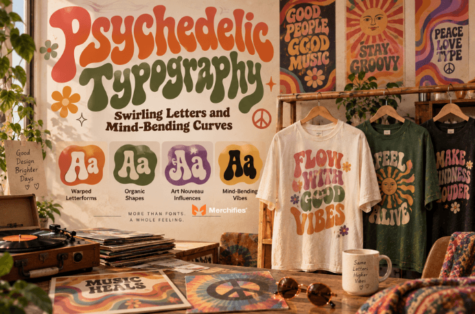
Connection to 70s counterculture gives psychedelic fonts specific cultural weight. These fonts don't just look different—they carry associations with music festivals, progressive politics, expanded consciousness, and deliberate rejection of mainstream commercial aesthetics. When you put psychedelic typography on a t-shirt, you're invoking that cultural context whether you intend to or not.
Best t-shirt applications for psychedelic fonts include festival wear, band merchandise, bohemian style pieces, and artistic statement designs. These fonts work for audiences who appreciate visual complexity and understand the cultural references. They may confuse or alienate viewers expecting conventional legibility.
Readability considerations become critical when applying psychedelic 70s retro fonts to t-shirt designs. The warped, flowing letterforms that create visual interest also slow down comprehension. Short words and phrases work better than long messages. Larger sizing becomes mandatory rather than optional. Simpler backgrounds—solid colors rather than busy patterns—help psychedelic type remain functional.
The fit/not-fit boundary for psychedelic fonts is clear: use them when visual impact matters more than instant readability, when your audience appreciates counterculture references, and when your message is short enough to survive stylization. Avoid them for practical information, corporate contexts, or any design requiring quick comprehension from viewers.
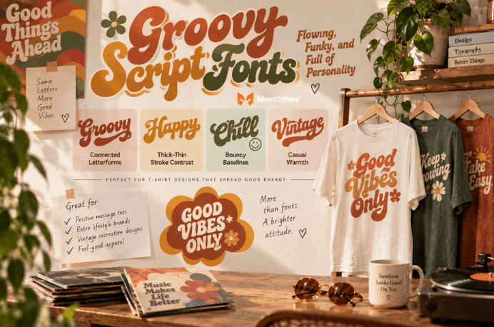
Groovy script fonts feature connected letters, dramatic thick-thin stroke contrast, bouncy baselines, and casual warmth that captured the optimistic, feel-good energy of 1970s mainstream culture. These fonts appeared everywhere from product packaging to television graphics, representing the friendly face of 70s typography.
The visual characteristics that define groovy scripts include connected letterforms that flow from one character to the next, creating visual continuity and movement. Thick-thin stroke contrast—where vertical strokes are heavier than horizontal ones—adds dynamic rhythm to the letterforms. Bouncy baselines where letters sit at slightly different heights contribute casual, hand-lettered energy that feels spontaneous rather than mechanical.
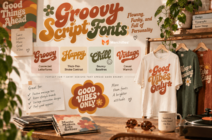
Why scripts capture the 70s casual, optimistic mood comes down to their human quality. Unlike geometric display fonts or rigid serif faces, scripts suggest a person holding a brush or pen. They feel personal, approachable, and warm. The 70s—despite economic challenges and social tensions—projected optimism in its popular visual culture, and groovy scripts embodied that forward-looking positivity.
Best t-shirt applications for groovy script fonts include retro lifestyle brands, positive message tees, vintage recreation designs, and any apparel meant to communicate friendly, approachable energy. As Lucas Bennett notes, script fonts work particularly well for designs featuring uplifting phrases, nostalgic references, or casual lifestyle messaging where warmth matters more than formality.
Sizing recommendations for groovy scripts on t-shirts require attention to the thin strokes. Those elegant thick-thin transitions that look beautiful on screen can disappear when printed at small sizes or on textured fabric. Minimum heights of approximately 1.5 to 2 inches for chest prints help ensure thin strokes remain visible. Adequate letter spacing—slightly looser than digital defaults—prevents connected scripts from becoming illegible blobs at distance.
Script fonts occupy the middle ground between disco glamour and psychedelic complexity. They're distinctive enough to read as authentically 70s but functional enough for practical t-shirt applications where viewers need to comprehend text quickly.
Bubble fonts feature inflated, rounded letterforms with soft edges that communicate youthful energy, pop-art influence, and the playful side of 1970s popular culture. These fonts dominated children's programming, mainstream advertising, and any context where approachability mattered more than sophistication.
The visual characteristics of bubble typography include letterforms that appear inflated like balloons, rounded corners that eliminate any sharp angles, and soft edges that feel touchable rather than distant. Pop-art influence shows up in the bold, graphic quality of these fonts—they photograph well, reproduce cleanly, and communicate instantly across distances.
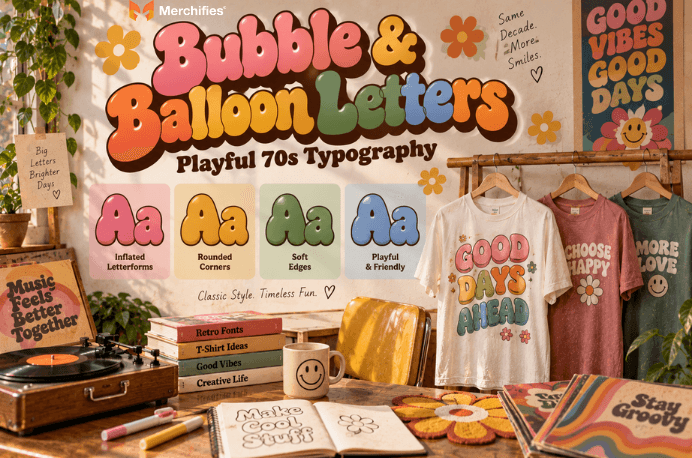
Connection to 70s pop culture positions bubble fonts as the mainstream, family-friendly face of retro typography. While disco fonts suggested nightlife and psychedelic fonts referenced counterculture, bubble letters appeared in Saturday morning cartoon titles, cereal boxes, and toy packaging. They carry associations with childhood nostalgia, innocence, and uncomplicated fun.
Best t-shirt applications for bubble fonts include fun casual wear, nostalgic throwback designs, family-friendly themes, and any apparel meant to communicate playful, approachable energy. These fonts work well for novelty designs, birthday shirts, and casual apparel where serious messaging would feel inappropriate.
When bubble fonts work: playful contexts, casual settings, audiences who appreciate nostalgic whimsy, and messages that benefit from friendly approachability. When bubble fonts undermine your design: serious messages, professional contexts, audiences expecting sophistication, and any situation where you need credibility more than charm.
The fit/not-fit boundary matters because bubble fonts carry strong personality that can overwhelm inappropriate contexts. A motivational quote in bubble letters reads differently than the same quote in groovy script—the font choice changes the emotional register of the message entirely.
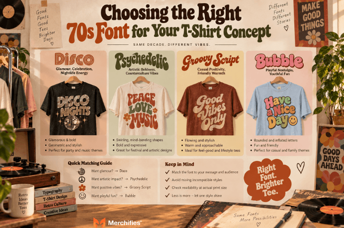
The right 70s retro font matches your design's mood, your target audience's expectations, and your t-shirt message's intended tone—getting this alignment wrong undermines even well-executed designs. A decision framework based on mood rather than arbitrary preference helps ensure your font choice serves your concept.
Match font substyle to mood: disco fonts for glamour, celebration, and nightlife energy. Psychedelic fonts for artistic boldness, counterculture references, and visual impact over readability. Groovy scripts for casual positivity, friendly warmth, and approachable vintage vibes. Bubble letters for playful nostalgia, youthful fun, and family-friendly contexts.
Target audience expectations should inform your choice. Younger audiences unfamiliar with 70s cultural context may respond differently to substyle distinctions than older audiences who lived through the era. Fashion-forward buyers may appreciate the visual complexity of psychedelic fonts while mainstream customers prefer the accessibility of groovy scripts.
Common mistakes to avoid when selecting 70s fonts for t-shirt designs include mixing incompatible substyles on the same design. Disco chrome and psychedelic swirls pull in different cultural directions—combining them creates visual confusion rather than retro richness. Choosing highly detailed fonts for small prints guarantees disappointment when intricate elements disappear. Style-message mismatch occurs when playful bubble letters carry serious messages or formal scripts accompany casual content.
Test method that saves revision time: always preview your font choice at actual print dimensions before finalizing. Most design software allows you to set up documents at actual size. Print a paper mockup if necessary. What looks perfect on a 27-inch monitor often reveals problems at 4-inch chest print dimensions.
The scope boundary for this decision framework: it helps you choose among 70s substyles, not between 70s fonts and other eras. If your concept doesn't specifically call for 70s retro energy, a different typography era might serve you better.
Authentic 70s color palettes feature burnt orange, avocado green, harvest gold, chocolate brown, and mustard yellow—colors that carry immediate vintage recognition and pair naturally with period typography. Color choice can make generic retro fonts feel specifically 70s or undermine even the most authentic 70s retro font selection.
The signature 70s color palette emerged from broader design trends: earth tones reflected the era's environmental awareness and rejection of synthetic-looking colors. Burnt orange, avocado green, and harvest gold appeared in everything from kitchen appliances to fashion to graphic design. Using these colors alongside 70s typography reinforces the era association and creates visual coherence.
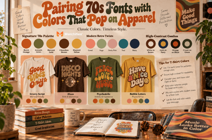
High-contrast combinations maintain readability on t-shirts where viewing conditions vary. White or cream text on chocolate brown fabric. Harvest gold text on navy fabric. Burnt orange on black. These combinations provide enough contrast for legibility while staying within period-appropriate color relationships.
How color choice shifts the vibe: authentic 70s palette colors create vintage recreation energy—designs that feel like preserved artifacts from the era. Modern interpretations might use 70s typography with contemporary color combinations: 70s fonts in coral and sage, groovy scripts in millennial pink, psychedelic type in neon gradients. These combinations acknowledge retro roots while positioning designs as contemporary fashion rather than nostalgia pieces.
Color considerations differ based on t-shirt base colors. Light garments (white, cream, heather gray) give you full freedom to use the complete 70s palette including browns and earth tones. Dark garments (black, navy, forest green) require lighter ink colors for visibility—harvest gold, cream, and lighter orange tones work better than chocolate brown or deep avocado. Ink coverage costs more on dark fabrics, so simpler color schemes often make practical sense.
The honest trade-off with authentic 70s palettes: they limit your options compared to working with any colors you want. You cannot achieve certain effects—like bright neon psychedelia—while staying strictly within period-accurate color ranges. Decide whether historical authenticity or creative freedom matters more for each specific project.
Different 70s font substyles perform differently across printing methods, with detail preservation varying significantly between screen printing and direct-to-garment (DTG) processes. Understanding these technical considerations before finalizing your font choice prevents expensive surprises at production time.
Screen printing works best with bold, clean letterforms. Disco fonts with complex inline details may require high mesh counts to capture fine elements, increasing production costs. Psychedelic fonts with intricate curves hold up better than you might expect because screen printing handles curves well—the challenge is extremely thin strokes that may not open properly on mesh. Groovy scripts and bubble letters generally screen print beautifully because their rounded, flowing forms lack the fine detail that causes problems.
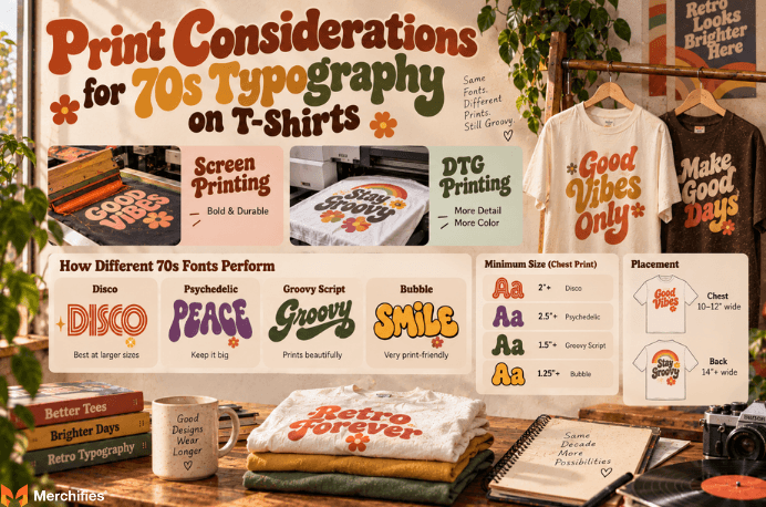
DTG printing handles fine detail more easily than screen printing but introduces different considerations. Color vibrancy on dark garments requires white underbase layers, adding to production costs and affecting how metallic or textured effects translate. The soft, slightly vintage quality of DTG prints can actually enhance 70s retro font aesthetics by avoiding the crisp precision of digital printing.
Minimum size recommendations protect your designs from illegibility. Complex disco fonts with inline details need minimum heights around 2 inches for chest prints. Psychedelic fonts with extreme distortion need 2.5 inches or larger. Groovy scripts can work at 1.5 inches if letter spacing is adequate. Bubble fonts, with their bold forms, can go as small as 1.25 inches while remaining readable.
Single-color versus multi-color printing creates cost and complexity differences. Authentic disco chrome effects require multiple ink passes or specialty metallic inks. Psychedelic designs often rely on color gradients that increase screen printing costs. Starting designs with single-color execution in mind—where color comes from the fabric rather than multiple ink layers—can reduce costs while maintaining authentic 70s energy.
Placement guidance for 70s typography: chest prints typically work best at 10-12 inches wide for maximum visual impact with detailed fonts. Back prints can scale up to 14 inches or larger, allowing you to use more intricate 70s retro font styles that would become illegible at chest print dimensions. Merchifies carries vintage-style apparel in multiple print options that accommodate different typography complexity levels—quality print-on-demand services handle these technical details so you can focus on design rather than production logistics.
Turning 70s typography knowledge into wearable designs requires moving from inspiration through font selection, color pairing, and print-ready file preparation with intention at each stage. The gap between admiring vintage fonts and successfully applying them to t-shirts is where many designers struggle.
The design workflow from concept to finished piece follows a logical sequence. Start with your message and mood—what does this design need to communicate? Match that mood to the appropriate 70s substyle using the framework from earlier sections. Select specific fonts within that substyle, testing multiple options at print dimensions. Apply color choices that reinforce the era reference or deliberately modernize it. Prepare files at proper resolution (300 DPI minimum) with clean vector paths where possible.
The personalization advantage of custom t-shirts means you create exactly the 70s vibe you envision rather than settling for mass-market options that approximate your concept. Want disco typography in colors that didn't exist in the 70s? Custom printing makes that possible. Prefer psychedelic fonts at sizes too large for standard retail? Custom production accommodates your vision.
Drawing on Lucas Bennett's work with vintage-inspired apparel, the key insight for turning typography enthusiasm into successful products is specificity. Vague "retro vibes" produce forgettable designs. Specific choices—this exact disco inline font, at this size, in harvest gold on chocolate brown cotton, positioned here—create designs with character and intention that viewers recognize and appreciate.
For designers ready to create their own 70s-inspired pieces, Merchifies makes custom apparel simple. Browse Merchifies collections including vintage-style tees, hoodies, and personalized gifts to find the base apparel that matches your retro design vision. For deeper typography education beyond 70s substyles, explore our complete guide to retro fonts for apparel designers covering multiple decades of vintage typography.
-d4c38c342cdf20ca.jpeg)

-b555fcc6b204c456.jpeg)