-da0801079a650a2e.jpeg)
17 Year Anniversary Quotes: 110+ Funny, Romantic & Furniture Wishes (2026)
Mar, 12 2026
Choosing the right color is just as important as the design when it comes to creating standout apparel. Comfort Colors is known for its soft, garment-dyed fabrics and a wide range of rich, vintage-inspired shades that give shirts a unique, lived-in look. In this Comfort Colors color guide, you’ll discover all available shades, from muted neutrals to bold statement colors, along with helpful tips for pairing colors with designs and audiences. Whether you’re designing for print-on-demand or choosing the perfect shirt for yourself, this guide will help you find the ideal hue for any style or occasion.
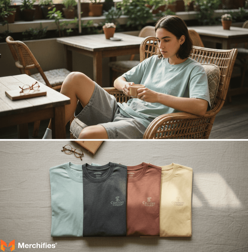
Comfort Colors shirts are renowned for their exceptional softness and a distinctive palette of garment-dyed hues. They offer a lived-in feel and vintage aesthetic straight off the hanger, making them more than just blank apparel. This guide explores the unique appeal and wide range of comfort color shirts colors, helping you choose the perfect shade for any need.
For years, Comfort Colors has been synonymous with that perfectly broken-in, favorite-tee feel. It's not just the soft fabric; it's the specific, earthy, and often muted color palette that truly sets them apart. These aren't your average bright, uniform dyes; they're designed through a specialized garment-dyeing process to evoke nostalgia and comfort. This process creates subtle variations and a slightly faded, sun-kissed look, making their collection of comfort color t shirts colors feel organic, individual, and effortlessly cool. Each shade is given an evocative name, like 'Chalky Mint' or 'Pepper,' adding to their unique charm.
The magic behind Comfort Colors' signature look lies in its meticulous garment-dyeing process. Unlike most apparel where fabric is dyed before construction, Comfort Colors dyes the entire garment after it's been sewn. This multi-stage process, involving specialized washes and dyeing procedures, transforms raw cotton into a soft, beautifully colored shirt. This extensive post-production treatment not only infuses the shirt with its color but also breaks down cotton fibers to achieve that signature soft, "worn-in" feel right from day one.
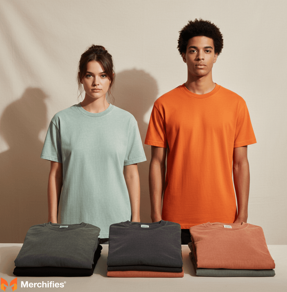
Comfort Colors primarily uses two dyeing methods: pigment dyeing and reactive dyeing. Pigment dyeing involves pigments that adhere to the fabric surface, creating many of the classic, vintage, and slightly faded comfort color shirts colors like 'Pepper' or 'Clay.' This results in a softer handfeel and a look that subtly evolves with each wash. Reactive dyeing, conversely, uses dyes that chemically bond with fabric fibers, yielding more vibrant, consistent, and colorfast shades such as 'Lagoon Blue' or 'Bright Salmon.' This distinction is crucial for customization, as pigment-dyed shirts often produce a softer print, while reactive-dyed shirts can hold brighter, more opaque ink colors with greater vibrancy.
A significant benefit of garment dyeing is the inherent 'pre-shrunk' advantage. Because shirts undergo extensive washing and dyeing *after* construction, most potential shrinkage occurs during manufacturing. This means Comfort Colors shirts maintain their fit, preventing disappointment after washing, a common issue with conventionally dyed apparel.
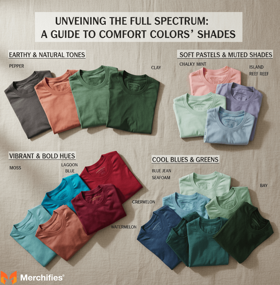
The full comfort colors color chart boasts over 80 unique shades, each with its own character. This extensive palette is a curated collection designed to evoke specific moods and aesthetics, serving as a true comfort colors color guide for distinctive vintage style.
Selecting the right Comfort Colors shade requires a strategic approach, whether for personal style or brand customization. This section offers practical guidance to navigate the extensive comfort colors color chart effectively.
Consider how colors influence mood and align with seasons. Lighter pastels like 'Chalky Mint' suit summer, while deeper tones like 'Clay' or 'Berry' are ideal for autumn. Neutrals like 'Pepper' or 'Ivory' offer everyday versatility. The beauty of Comfort Colors is that even bold shades have a softened quality, making them easy to wear and experiment with.
For brands, chosen colors are an extension of identity. Align your shade with your brand's core message: 'Moss' or 'Walnut' for rustic brands, 'Crimson' or 'Lagoon Blue' for energetic ones. Always consider your target audience and the context of the apparel. Pigment-dyed shirts like 'Pepper' offer a vintage print effect, while reactive-dyed options like 'Lagoon Blue' ensure brighter, more vibrant designs. Communicate with your decorator about the specific shade to optimize printing techniques.
Be aware that online swatches can differ from the actual product due to screen variations and dye lot differences. For critical branding or large orders, always try to obtain physical swatches or sample shirts to see the true hue under natural light, ensuring the final product matches your vision.

Comfort Colors stands apart from competitors like Gildan or Bella+Canvas primarily due to its garment-dyed nature and resulting vintage aesthetic. While other brands offer uniform, bright, fabric-dyed colors, Comfort Colors' pigment-dyed options, such as 'Pepper' or 'Chalky Mint,' possess a unique soft, faded look with nuanced depth. This commitment to a specialized dyeing process creates a "worn-in," natural, and earthy aesthetic, appealing to those who prioritize a distinctive, vintage-inspired color story.
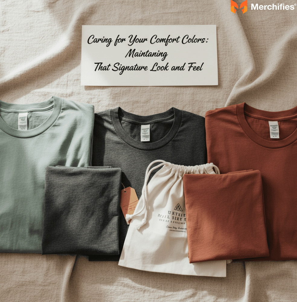
Proper care is essential to preserve the signature softness and unique color of your Comfort Colors garments. Wash with like colors in cold water, turning the garment inside out. Avoid harsh detergents or bleach. Tumble dry on low heat or hang dry. This care helps maintain their aesthetic appeal, understanding that the subtle evolution of pigment-dyed colors is part of their intended vintage charm.
Comfort Colors shirts and their extensive comfort colors color guide are widely accessible. For individual retail purchases, check specialty boutiques, college bookstores, and major online retailers. For businesses or bulk orders, wholesale blank apparel suppliers like S&S Activewear, SanMar, and AlphaBroder carry the full range of styles and over 80 colors. Many custom screen printing and embroidery shops also have direct access to these catalogs, often with physical samples available.
The Comfort Colors universe offers a philosophy rooted in comfort, authenticity, and a distinctive aesthetic. Their garment-dyeing process and expansive comfort color shirts colors palette, from earthy 'Pepper' to vibrant 'Lagoon Blue' and soft 'Chalky Mint,' are curated to feel natural, lived-in, and effortlessly stylish. Understanding their unique dyeing methods and evocative naming empowers informed choices for personal style or impactful custom apparel. Comfort Colors remains a timeless icon, proving that true appeal lies in comfort, quality, and a color palette that speaks volumes.
-d4c38c342cdf20ca.jpeg)


-b555fcc6b204c456.jpeg)