 Worldwide Shipping
 Secure Payments
 Free Return
 Local Support
-da0801079a650a2e.jpeg)
17 Year Anniversary Quotes: 110+ Funny, Romantic & Furniture Wishes (2026)
Mar, 12 2026
Discover how to create coordinated vintage looks with your best friend. From 70s earthy tones to 90s grunge aesthetics, find the perfect retro matching tees that celebrate your friendship in throwback style.
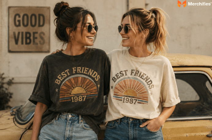
Based on Oliver Grant's research into friendship fashion, vintage t-shirts create the perfect foundation for best friend matching looks because their nostalgic graphics and worn-in aesthetics photograph beautifully while sparking genuine conversation about shared style. Unlike basic coordinated outfits that feel forced, vintage-inspired matching tees carry personality through distinctive design elements: faded concert graphics, retro typography, classic cartoon characters, and era-specific color palettes. They tell a story. And they let two friends celebrate connection through throwback aesthetics that feel intentional rather than costume-like.
As of summer 2026, vintage-style apparel continues as a practical choice for casual fashion precisely because it blends sustainable appeal with one-of-a-kind character. For best friends seeking coordinated looks, the retro aesthetic offers something mass-produced matching sets cannot: genuine visual interest paired with comfortable, lived-in softness.
Core principles for vintage matching looks:
Choose the same era for cohesive design coordination
Match graphic styles rather than exact designs
Coordinate color palettes within the same vintage spectrum
Consider print-on-demand for guaranteed size availability
Vintage t-shirts dominate casual fashion because they combine nostalgic design appeal with sustainable style choices that resonate with conscious consumers. The authentic worn-in aesthetic cannot be replicated by fast fashion. Each piece carries history, whether that's a faded concert graphic featuring hand-drawn band artwork from decades past or the distinctive soft hand-feel that only years of washing can produce.
The design appeal extends beyond simple nostalgia. Vintage graphics showcase artistic styles rarely seen in modern mass production: hand-lettered typography with natural imperfections, screen-printed illustrations with visible ink texture, and color palettes that have softened into muted harmony over time. These design elements create visual depth that flat digital prints simply cannot match.
Conversation-starting designs transform simple tees into social catalysts. A vintage band shirt featuring original tour artwork or retro sports logo with period-accurate typography invites questions, shares memories, and creates instant connection points between strangers. For friend groups, this translates to shared identity through coordinated throwback style.
What makes the current landscape different is accessibility. Print-on-demand services now offer vintage-inspired reproductions that capture the aesthetic without requiring hours of thrift hunting. You can achieve authentic retro vibes with modern convenience. Consistent sizing. Matching availability. Custom graphics that reflect your specific friendship rather than whatever the thrift store happened to stock that day.
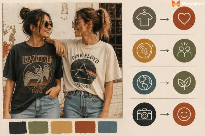
Vintage-style matching tees combine retro graphics, washed fabrics, and throwback design aesthetics specifically created for coordinated friend looks. The relaxed silhouettes photograph well together. The faded color palettes complement each other naturally. And the nostalgic graphics provide built-in conversation starters without requiring explanation.
The design elements that define vintage t-shirts fall into several distinct categories. Concert and band graphics feature hand-drawn artwork, often with elaborate illustrations surrounding the band name in period-specific lettering. Movie and pop culture designs showcase original theatrical poster artwork or character illustrations in the artistic style of their release decade. Sports graphics display team logos in their historical iterations, often with different color schemes and typography than modern versions.
Typography alone separates vintage from modern designs. Seventies lettering favored groovy, rounded fonts with psychedelic flourishes. Eighties typography went bold and angular, often with chrome effects or neon outlines. Nineties text leaned grunge: distressed, slightly off-kilter, intentionally imperfect.
Understanding the difference between authentic vintage and vintage-inspired matters for coordination purposes. Authentic vintage pieces feature single-stitch construction, era-specific tags, and natural fading from decades of wear. Finding two matching authentic pieces in correct sizes is nearly impossible since each is genuinely one-of-a-kind. Vintage-inspired tees use modern construction with retro design sensibilities. Pre-washed fabrics, distressed prints, and throwback graphics create the aesthetic without the sourcing challenge.
The friendship connection runs deeper than fashion alone. Celebrating connection through shared style moments creates lasting memories that photographs can capture but words often cannot. Matching vintage tees become physical symbols of friendship that you actually wear and enjoy rather than store in a drawer.
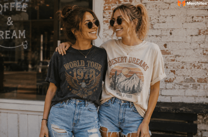
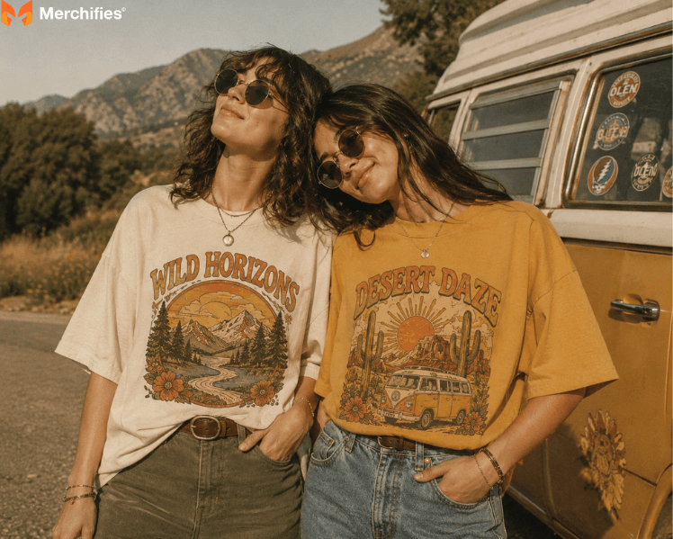
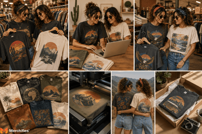
The 1970s aesthetic works best for relaxed, boho friend pairs who prefer warm earth tones and nature-inspired illustrations. This era's design language speaks to laid-back friendships with an appreciation for organic beauty and classic rock sensibilities.
Color palette: Mustard yellow, burnt orange, olive green, rust brown, and cream. These warm earth tones photograph beautifully together and complement most skin tones naturally.
Typography traits: Rounded, groovy fonts with psychedelic flourishes. Letters often feature shadow effects that create depth, with flowing curves that mirror the organic nature imagery popular during the decade.
Common graphic elements:
Sunset gradients with layered orange and purple bands
Mountain silhouettes with hand-drawn linework
Nature-inspired illustrations featuring trees, flowers, and wildlife
Classic rock band logos with elaborate hand-drawn artwork
Psychedelic swirls and organic flowing patterns
Retro van and camper illustrations
Best for: Friends who share outdoor interests, festival attendance, or appreciation for classic rock music. The 70s vibe communicates laid-back authenticity without trying too hard. Merchifies carries vintage-inspired designs in 70s earthy tones, 80s pop graphics, and 90s minimalist options suitable for coordinated friend duos.
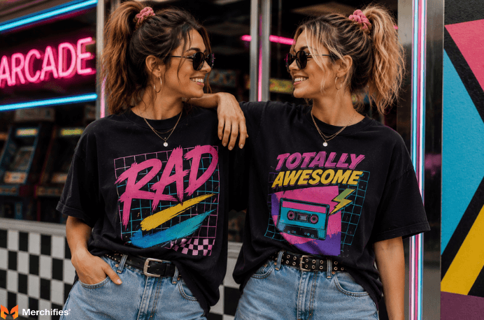
The 1980s delivers maximum visual impact for statement-making duos who love attention and photograph frequently. As Oliver Grant notes, this era's design characteristics demand to be seen, making it ideal for friends who want their coordination to stand out in any crowd.
Color palette: Hot pink, electric blue, lime green, purple, yellow on black, and neon combinations. These high-contrast colors create instant visual energy and photograph dramatically even from a distance.
Typography traits: Bold sans-serif fonts, often rendered with metallic chrome effects or neon glow outlines. Angular letterforms with geometric precision replaced the flowing organic shapes of the previous decade.
Common graphic elements:
Geometric patterns with grid backgrounds
MTV-era music artwork with bold shapes
Arcade game graphics and pixel-style illustrations
Movie logos from 80s blockbusters
Synthesizer and electronic music imagery
Palm trees and Miami Vice-inspired beach scenes
Retro computer and technology graphics
Best for: Friends who embrace bold fashion choices and want their matching looks to make an immediate impression. The 80s aesthetic suits social media content creation, themed parties, and any situation where standing out matters more than blending in.
The 1990s grunge aesthetic offers understated coordination for friends who prefer their matching looks to feel discovered rather than designed. This era favors simplicity and intentional imperfection over bold statements.
Color palette: Forest green, burgundy, faded black, washed navy, muted gray, and brown. These tones stay understated and versatile, working seamlessly into everyday wardrobes without demanding attention.
Typography traits: Deliberately imperfect letterforms that appear photocopied multiple times. Distressed wordmarks with worn edges, slightly off-kilter positioning, and hand-stamped aesthetics define the decade's visual language.
Common graphic elements:
Single-color logos with minimal detail
Distressed wordmarks showing intentional wear
Minimalist illustrations with rough line quality
Band logos from grunge and alternative rock acts
Skateboard and streetwear brand-style graphics
Simple geometric shapes with worn edges
Vintage sports team logos in muted colorways
Best for: Friends who value subtlety and want their coordination to read as effortless rather than planned. The 90s aesthetic works for daily wear without looking like you tried too hard to match.
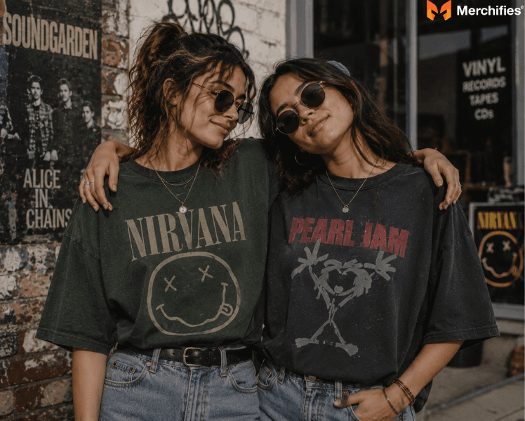
Specific graphic categories within vintage design work better than others for coordinated friend looks, depending on shared interests and desired statement level. Understanding these categories helps you select designs that reflect your actual friendship.
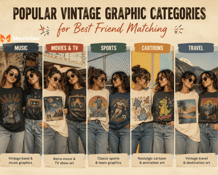
Band and music graphics remain the most popular category for vintage matching. Concert tour tees feature elaborate artwork created specifically for that tour, making each design a mini-poster. Friends can match identically with the same band or coordinate with different artists from the same genre or era. Classic rock pairs with classic rock. Hair metal coordinates with hair metal. The key is maintaining visual consistency through similar illustration styles and color temperatures.
Movie and television graphics offer instant recognition factor. Original theatrical poster designs, particularly from 80s blockbusters, create strong nostalgia reactions. Friends can twin with identical movie tees or complement with different films from the same director, genre, or year. The typography and illustration style of movie posters evolved distinctly by decade, so staying within the same era maintains design cohesion.
Sports graphics provide versatile matching options. Vintage team logos often look dramatically different from current versions, with different fonts, mascot illustrations, and color applications. Friends supporting the same team can match with different vintage eras of that team's branding. Friends from different cities can coordinate with same-era designs from their respective teams.
Cartoon and animation graphics appeal to friends with shared childhood memories. Saturday morning cartoon characters, classic anime, and vintage Disney designs all carry specific era markers in their illustration style. The line weight, color palette, and character design immediately signal whether artwork comes from the 70s, 80s, or 90s.
Destination and travel graphics feature vintage tourism artwork: national park posters, beach town illustrations, and city skylines rendered in period-appropriate artistic styles. Friends who traveled together can match with destination graphics, while those planning future trips can coordinate with aspirational location designs.
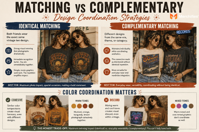
Choosing between identical matching and complementary design pairing determines how your coordinated vintage looks will read to observers. Each approach offers distinct advantages worth considering before purchasing.
Identical matching means both friends wear the exact same vintage tee design, sized appropriately for each person. This creates strong visual twinning that photographs dramatically. The immediate recognition factor makes identity clear in group settings. You are unmistakably together. For identical matching, the design itself carries all the statement. Simple, iconic graphics work better than busy, detailed illustrations because the repetition amplifies impact.
Complementary matching involves different designs from the same era, theme, or graphic category. Perhaps both friends wear 80s movie tees, but one features Ferris Bueller while the other shows The Breakfast Club. This maintains individuality while coordinating aesthetics. The connection reads as intentional without identical repetition. Complementary matching requires more design consideration: you need graphics with similar color temperatures, illustration styles, and visual weight.
The honest trade-off: if you want maximum photo impact for special occasions, identical matching delivers stronger visual punch. However, identical tees become impractical for regular wear since you cannot style the same piece differently without looking like you forgot you already wore it. Complementary pairing offers versatility for daily wardrobe integration without sacrificing coordination. You cannot fully have both maximum twinning impact and everyday wearability without choosing one approach over the other.
Color coordination matters regardless of matching strategy. Two friends in warm-toned vintage graphics (mustard, orange, burgundy) photograph cohesively even with different designs. Mixing a warm-toned 70s sunset graphic with a cool-toned 80s neon design creates visual discord despite both being vintage.
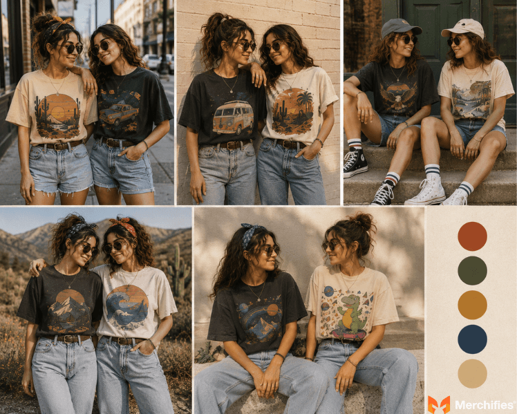
Coordinating outfits beyond the tee itself creates polished matching looks that feel intentional rather than accidental. Small styling decisions amplify the vintage aesthetic while flattering both friends.
Coordinating bottoms without exact matching builds visual cohesion. Both friends in denim reads as unified. Both in neutral shorts creates summer coordination. The wash of denim matters for vintage styling: lighter, more worn washes complement faded vintage graphics while dark rigid denim can overpower softer vintage colors. Avoid matching pants exactly unless deliberately creating a full uniform effect.
Balance oversized vintage fit with intentional styling choices. Tucking the front of an oversized tee creates waist definition while showing the full graphic above the waistband. Rolling sleeves adds structural interest and adjusts proportions. One friend might wear fitted while the other goes relaxed, creating visual variety within the coordination framework.
Accessory coordination completes the look and can echo design elements from the tees. Matching bandanas in colors pulled from the graphic create subtle visual links. Similar jewelry tones (all gold or all silver) maintain consistency without requiring identical pieces. Sunglasses in the same general style family work well for photo coordination: both in round frames or both in wayfarers, matching the era of your vintage tees.
Photo-ready preparation: Choose complementary backgrounds that let the tee graphics pop. Neutral walls, natural settings, and solid-color backdrops allow the vintage designs to remain the focal point. Staggered poses create visual interest compared to side-by-side static positioning. Ensure the tee graphics remain visible rather than obscured by crossed arms or bag straps. Angle your bodies slightly to display the full design rather than facing dead-on.
Sourcing options range from authentic thrift finds to custom print-on-demand services, each with distinct advantages for friend matching. Understanding the trade-offs helps you choose the right approach for your coordination goals.
Thrift stores and vintage shops offer authentic pieces with genuine history. The worn-in softness and unique fading cannot be replicated. The design details tell real stories: an original concert tee actually attended that tour. However, finding two matching authentic vintage tees in correct sizes for both friends borders on impossible. Single-stitch vintage pieces are one-of-a-kind by definition. Even finding similar designs from the same era requires significant hunting across multiple stores.
Print-on-demand services solve the matching availability problem entirely. Custom vintage-inspired designs guarantee both friends receive identical or complementary pieces in their exact sizes. Personalization options let you create graphics that reflect your specific friendship rather than generic retro themes. Design quality varies by provider; look for services that understand vintage aesthetics: appropriate typography, era-accurate color palettes, and properly distressed print effects.
Vintage reproduction brands offer consistent stock of retro-inspired designs. Quality varies significantly between manufacturers. Most lack customization options, and size availability for coordinated pairs is not guaranteed. The designs tend toward safe, widely recognizable graphics rather than unique or personalized options.
For comprehensive guidance on coordinating with your best friend beyond vintage aesthetics, our ultimate guide to matching best friend shirts covers strategies across all styles.
Browse Merchifies vintage-inspired matching designs , including 70s earthy tones, 80s pop graphics, and 90s minimalist options sized from XS through 4XL, to find the style that matches your friendship era.
Authentic vintage typically runs smaller than modern sizing, requiring strategic adjustments for coordinated looks. Understanding sizing differences prevents mismatched fit outcomes that undermine coordination efforts.
For authentic vintage pieces, size up at least one size from modern equivalents to achieve the intended oversized look. A vintage medium often fits like a modern small. If you typically wear large, start with vintage XL for similar proportions. Vintage sizing also tends shorter in body length and narrower in shoulder width compared to modern cuts, which affects how graphics display on your body.
Graphic placement changes with fit. An oversized vintage tee displays chest graphics higher on your torso than a fitted version of the same design. For matching purposes, decide whether you want the graphics at the same visual height (requiring similar fits) or at natural heights for each person's body (requiring different size approaches).
Discuss fit preferences with your matching partner before ordering. Some friend pairs prefer both oversized for relaxed symmetry. Others want one fitted and one relaxed for visual contrast within coordination. Neither approach is wrong, but agreeing beforehand prevents disappointment.
Print-on-demand offers a significant advantage here: consistent modern sizing charts across matching orders eliminate guesswork entirely. Both friends can reference the same measurements and trust their pieces will fit as expected. No vintage sizing lottery. No hoping the thrift store has your size in a matching design.
Drawing on Oliver Grant's work with friendship expression, the right fit transforms matching vintage t-shirts from costume pieces into everyday wardrobe staples you actually want to wear. Proper sizing ensures your vintage matching looks feel comfortable enough for real life rather than just photo opportunities.
-d4c38c342cdf20ca.jpeg)

-b555fcc6b204c456.jpeg)