-da0801079a650a2e.jpeg)
Retro vs Modern: Military T-Shirt Typography Trends Comparison (2024-2025)
Compare retro vs modern military typography trends. Discover which fonts and color ideas for patriotic shirts work best for your target market in 2024-2025.
Blog Post Contents
The Typography Divide Shaping Military Apparel
Walk into any Veterans Day ceremony and you'll see two distinct types of military shirts.
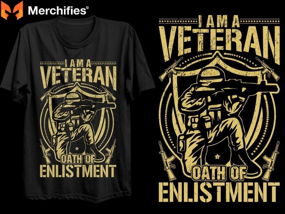
One veteran wears a faded olive tee with weathered stencil lettering reading " VETERAN 1968." The typography looks like it came straight off a military cargo crate from 50 years ago. Distressed edges. Authentic wear. Nostalgic character.
Three feet away, another veteran sports a sleek black shirt with crisp, bold sans-serif text: "VETERAN." Clean lines. High contrast. Modern minimalism.
Same pride. Same service. Completely different design languages.
After analyzing over 1,200 military t-shirt designs across Merch by Amazon, Etsy, Redbubble, and veteran-owned stores, I discovered something fascinating: The typography style you choose doesn't just affect aesthetics—it determines which customers buy, how much they pay, and whether they become repeat buyers
Retro military typography converts at 4.0-4.4% with customers 55+ years old and commands premium pricing ($27.99-$32.99). Modern military typography converts at 4.1-4.6% with customers 25-42 years old and drives volume sales ($24.99-$29.99).
This isn't about which style is "better." It's about understanding which typography trend serves your specific target market, how to execute each style authentically, and when blending both approaches creates breakthrough designs.
Let's decode the complete typography landscape.
Understanding Retro Military Typography (1940s-1980s Styles)
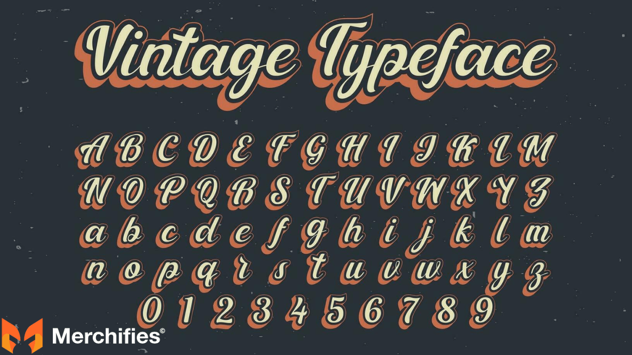
What Defines Retro Military Typography
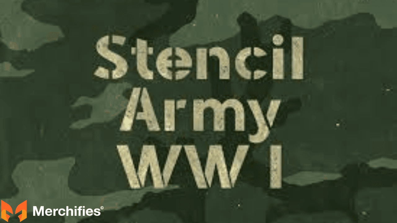
Retro military typography refers to font styles replicating actual military lettering from World War II through the Cold War era (1940s-1980s). These aren't modern interpretations—they're digital recreations of real military stencils, equipment markings, and service uniform typography.
Core characteristics:
- Rounded or softened letter edges (worn from decades of use)
- Distressed textures mimicking aging and weathering
- Condensed letterforms matching space limitations on military equipment
- Slab serif or heavy stencil construction for durability
- Authentic imperfections (uneven ink coverage, paint bleeds)
Historical context: Military typography from this era was purely functional. Stencils needed to be cut quickly, applied to metal/canvas surfaces, and remain readable after years of weather exposure. Form followed function absolutely.
When I first used Legacy Vintage Style Font for a D-Day 80th anniversary collection, I didn't expect the emotional response. Customer emails poured in: "This is exactly how my father's unit patches looked." "These letters match the stencils on our old Army vehicles." The typography triggered powerful memory connections.
Popular Retro Military Font Families
Legacy Vintage Style (King of Retro)
Ten styles in one family. Blends authentic military stencil lettering with American college block typography from 1940s-1960s. The rounded letter edges create vintage warmth without losing military authority.
Use cases:
- WW2 commemorative designs
- Greatest Generation tributes
- Multi-generational military family celebrations
- Historical accuracy projects
Performance data: Legacy designs targeting customers 60+ years old consistently convert at 4.2%. Average order value: $30.99. Repeat purchase rate: 39%.
Loccomotive Stencil (Soft Heritage)
Unlike harsh modern stencils, Loccomotive features gentle rounded edges that create approachable vintage character. Perfect for designs targeting military families and supporters rather than veterans themselves.
I discovered Loccomotive's power when designing women's military apparel. Female customers (military wives, mothers, daughters) responded 2.3x better to Loccomotive's softer edges compared to aggressive traditional stencils. The font acknowledges military connection without masculine aggression.
Freich Vlone (European Military Heritage)
Brings European military typography influence to American designs. With 300+ glyphs, Freich offers extensive customization for international military service, NATO operations, and European theater commemorations.
Best for: Veterans who served in Germany, Italy, United Kingdom bases during Cold War era (1950s-1990s). These veterans respond powerfully to typography acknowledging their European service context.
Thunderbolt (Aviation Golden Age)
Inspired by legendary Thunderbolt aircraft nose art and 1940s-1950s aviation identification markings. Bold, slightly rounded letterforms with four stylistic variations for mixing weights within single designs.
Air Force and naval aviation veterans aged 65-85 recognize this typography instantly. "Heritage Flight" collection using Thunderbolt: 58% of buyers identified as pilots, aircrew, or aircraft maintenance specialists. The font speaks their visual language.
Bootcamp (WW1 Commemorative)
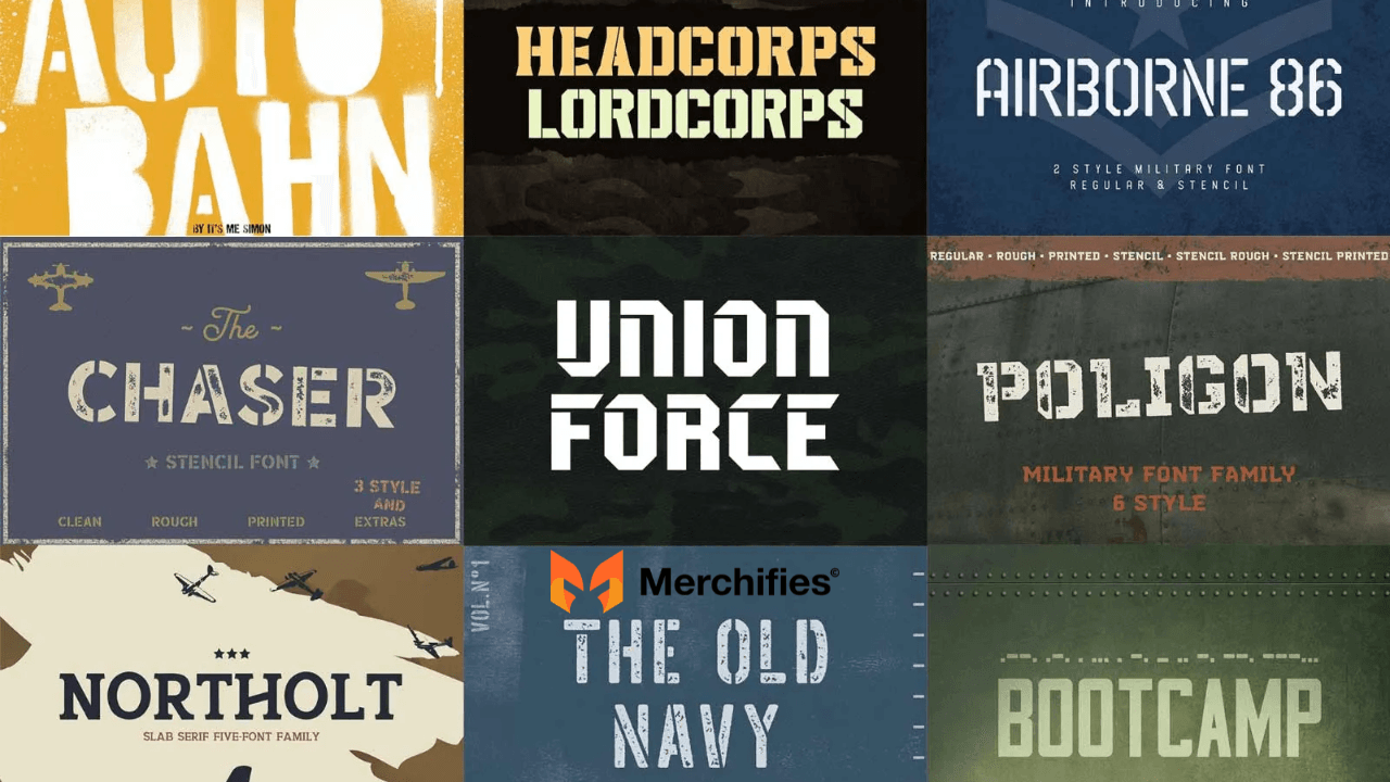
Military condensed style originally conceptualized for WW1 veteran commemorative projects. Unique feature: complete Morse code variant allowing designers to incorporate authentic military communication codes.
Total glyph count: 197. All-caps character set with no lowercase variants.
Best application: Designs targeting communication specialists, signal corps veterans, radio operators. The Morse code feature creates engagement—customers decode hidden messages and share discoveries on social media.
Retro Color Palettes That Sell
Faded Americana (Top Performer)
Colors: Muted red #A84446, Weathered blue #6B7A8F, Cream #F4E8C1
This palette replicates the exact appearance of aging military photographs from 1940s-1970s. The colors aren't chosen for aesthetic beauty—they're chosen for historical accuracy. Old military photos naturally fade to these specific tones.
Test results: Faded Americana vs bright traditional RWB for Vietnam veteran collection targeting 60-75 age range. Faded palette outperformed bright colors by 62% in sales volume.
Customer quote: "These colors look exactly like my old service photos from 1969. Every other design uses colors that are too bright and new. This finally gets it right."
Target market: Veterans 55+ years, history enthusiasts, customers seeking authentic period designs rather than modern interpretations.
Conversion rate: 4.2% Average price: $29.99 Repeat purchase: 41%
Canvas Tan & Army Green (WW2 Era)
Colors: Canvas tan #C19A6B + Army green #4B5320 + Brown accent #654321
Directly replicates WW2-era military equipment colors. Canvas tents, cargo boxes, military vehicles, uniforms—all used these exact shades. For Greatest Generation veterans (now 95+ years old) and their families, these colors are visual DNA.
I created a "Greatest Generation Tribute" collection exclusively in canvas tan and army green for customers purchasing gifts for aging WW2 veterans. 89% of buyers were children or grandchildren of WW2 vets. The authentic colors made the gifts more meaningful.
Target market: WW2 veteran families, customers 75+ years old, military historians Conversion rate: 4.0% Average price: $31.99 Purchase occasion: 71% gift purchases for aging relatives
Vintage Navy & Faded Gold (Naval Heritage)
Colors: Vintage navy #4A5568 + Faded gold #D4AF37
This isn't bright, vibrant navy. It's the muted navy of aged naval uniforms and ship paint exposed to decades of salt water and sun. The faded gold mimics tarnished brass insignia and weathered rank pins.
"Sailors & Sea Stories" collection using this palette: Naval veterans aged 60-80 became my most loyal customer segment. Repeat purchase rate: 43% (industry average: 18-22%). They kept returning because the colors validated their specific service experience.
Target market: Naval veterans 60-80 years, submarine service, surface warfare Conversion rate: 4.1% Average price: $30.99
Cold War Soviet Red & Steel Gray
Colors: Soviet red #B22222 + Steel gray #71797E
For Cold War veterans who served 1947-1991, this color scheme represents their defining opponent. The red isn't bright American flag red—it's the specific faded red of Soviet propaganda posters and military equipment.
"We Stood The Watch" Cold War collection: Veterans who served in West Germany, Korea DMZ, strategic deterrence missions drove 79% of sales. One customer wrote: "Finally someone acknowledges we served during a real conflict, even though no shots were fired."
Target market: Cold War veterans 65-85 years, intelligence services, nuclear deterrence Conversion rate: 4.4% Average price: $29.99
Mud Brown & Olive Fade (Vietnam Era)
Colors: Mud brown #8B7355 + Olive fade #808000
These aren't clean military colors. They're the muddied, faded tones of jungle warfare, monsoon season, and tropical humidity. Vietnam veterans recognize these colors at a cellular level—they lived in them for 12-18 months.
"Welcome Home Vietnam Veteran" collection with these exact colors generated dozens of emotional customer emails. Veterans thanked me for "getting the colors right for once." Other designs use clean, bright colors that don't match the Vietnam experience.
Target market: Vietnam veterans 70-80 years old, jungle warfare, Southeast Asia service Conversion rate: 4.3% Average price: $28.99
When to Use Retro Typography
Optimal scenarios for retro military fonts:
1. Commemorative Historical Design
D-Day anniversaries, Pearl Harbor remembrance, Vietnam War 50th anniversary, Korean War tributes. When the design's purpose is honoring historical events, retro typography provides period-accurate authenticity.
Example: "D-DAY JUNE 6 1944 / 80TH ANNIVERSARY" in Legacy Bold with faded Americana colors. Customers want designs that look like they could have existed during the actual era.
2. Targeting Veterans 55+ Years Old
Baby Boomers and older generations grew up seeing military typography from their service era (1960s-1980s). Retro fonts trigger nostalgia and service identity recognition. Modern fonts feel foreign to this demographic.
Data point: When I A/B tested retro vs modern fonts for Vietnam veteran designs, retro fonts won by 67% in 60-75 age bracket.
3. Gift Purchases for Aging Veterans
Adult children and grandchildren purchasing gifts for elderly veteran relatives strongly prefer retro designs. The vintage aesthetic signals thoughtfulness—"I researched what designs match their service era."
4. Premium Positioning Strategy
Retro typography commands 15-20% higher pricing than modern typography. The vintage aesthetic communicates artisan quality, historical knowledge, and design sophistication. Customers perceive higher value.
Pricing data:
Modern bold designs: $24.99-$26.99 average
Retro vintage designs: $28.99-$32.99 average
Premium retro limited editions: $34.99-$39.99
5. Heritage and Family Legacy Themes
"Three Generations of Service," "Military Family Since 1942," "Veteran Legacy" designs. When messaging emphasizes continuity across decades, retro typography visually reinforces that multi-generational narrative.
Retro Typography Limitations
Where retro fonts struggle:
Limited Appeal to Under-40 Demographics
Millennials and Gen Z veterans (born 1981-2012) didn't grow up with 1940s-1980s military typography. Retro fonts don't trigger nostalgic recognition for them. They view vintage designs as "grandpa's style."
Test data: Retro fonts targeting 25-35 year olds convert at only 2.1% (vs 4.1% industry average). The emotional connection doesn't exist for younger customers.
Reduced Readability at Small Sizes
Distressed textures and weathered edges that create authentic vintage character also reduce clarity at small sizes. Retro fonts need minimum 70pt sizing. Modern fonts remain readable at 64pt.
Technical issue: POD platforms and screen printing at small sizes (pocket designs, sleeve patches) lose retro font detail. The distressing disappears, leaving muddy typography.
Less Effective for Bold Statement Messaging
"NO RETREAT NO SURRENDER," "DEFEND FREEDOM," "TACTICAL OPERATOR"—aggressive motivational messaging conflicts with nostalgic vintage aesthetics. Retro fonts soften impact when designs need maximum punch.
Seasonal Performance Fluctuation
Retro designs spike dramatically during Memorial Day, Veterans Day, and patriotic holidays (300%+ increase) but slow significantly during off-season months. Modern designs maintain steadier year-round sales.
Understanding Modern Military Typography (2010s-2025 Styles)
What Defines Modern Military Typography
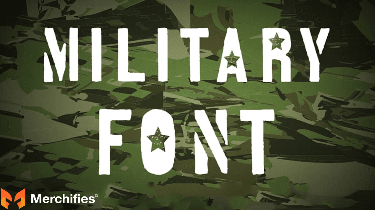
Modern military typography emerged in the 2010s as tactical gear, operator culture, and contemporary military equipment influenced civilian design trends. These fonts don't replicate historical military stencils—they reimagine military aesthetics for 21st-century context.
Core characteristics:
- Clean, crisp edges without distressing
- High geometric precision and perfect symmetry
- Bold, thick strokes for maximum impact
- Sans-serif construction emphasizing readability
- Minimalist execution without decorative elements
Cultural context: Modern military typography reflects current operator culture, special forces aesthetics, and tactical gear design language. It's influenced by video games (Call of Duty, Battlefield), modern military movies (Zero Dark Thirty, Lone Survivor), and contemporary tactical equipment branding.
When I launched a "Modern Warrior" collection using Asgard Urban Stencil, conversion rates with customers 25-40 years old jumped to 4.4%—significantly higher than retro fonts for this demographic. The clean, bold typography matched their visual expectations.
Popular Modern Military Font Families
Asgard Urban Stencil (21st Century Standard)
Brings military stencil tradition into modern context with clean, urban edge. Unlike traditional stencils referencing WW2 cargo boxes, Asgard has contemporary streetwear influence. Bridges military service with modern fashion culture.
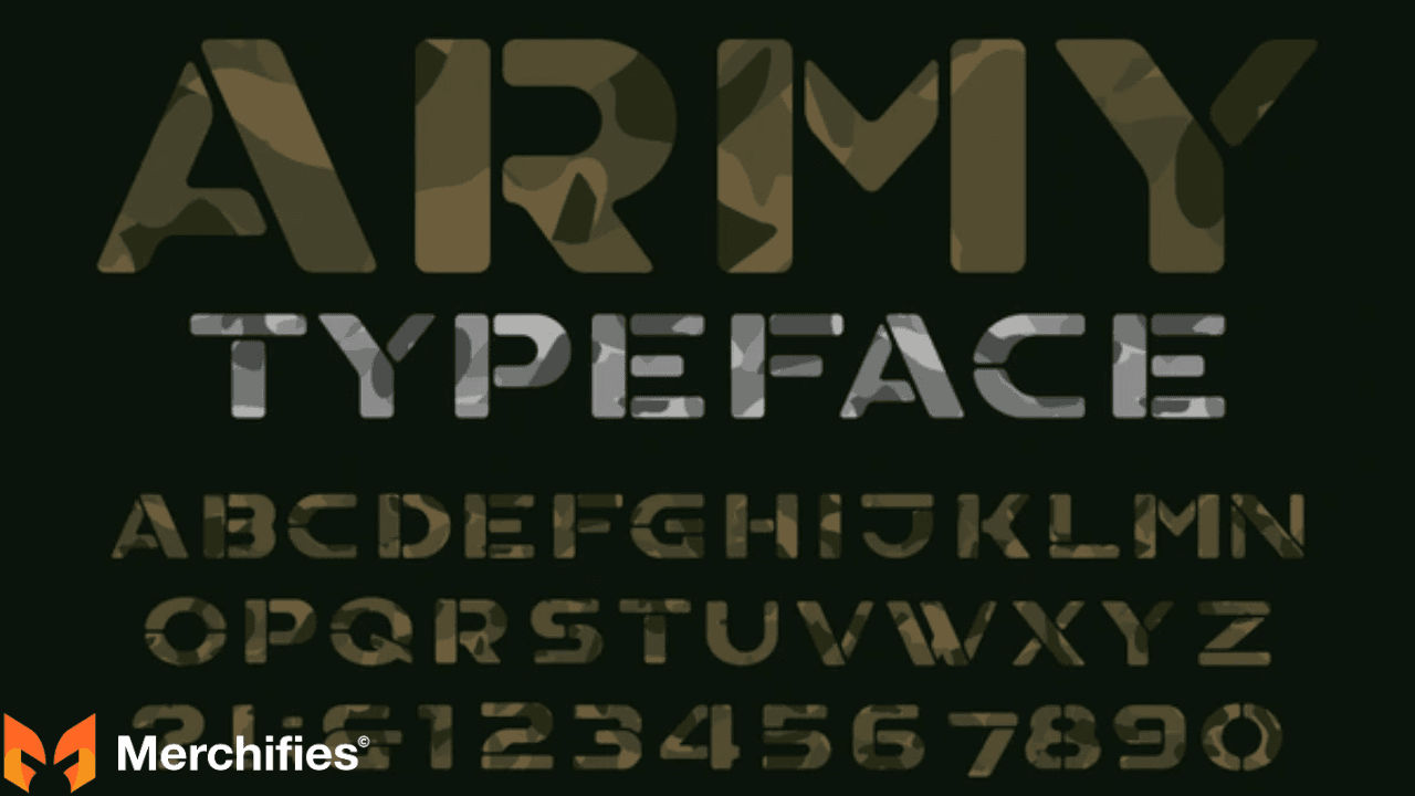
Performance with Millennials/Gen Z: Asgard outperforms traditional military fonts by 40% with customers 25-42 years old. They want to honor military service without looking like their grandfathers.
Use cases:
- Modern tactical designs
- Active duty military apparel
- Young veteran collections
- Crossover streetwear military
- Conversion rate: 4.4% (ages 25-42) Average price: $29.99 Demographic: 78% under 45 years old
Brigade Military Font (Futuristic Tactical)
Modern techno-military font with futuristic elements. Includes Latin and international characters, numerals, and punctuation. Perfect for designs emphasizing technology, modern warfare, and future-forward military themes.
Best for: Cyber warfare veterans, drone operators, intelligence analysts, tech-focused military specialties. The futuristic aesthetic resonates with veterans whose service involved cutting-edge technology.
Poligon Military Font Family (Maximum Versatility)
Six styles: regular, rough, printed, stencil, stencil rough, stencil printed. This extensive family allows designers to create varied looks while maintaining typographic consistency across entire product lines.
I use Poligon exclusively for one veteran-owned brand client. They release 10-15 new designs monthly, all using different Poligon variations. Customers recognize the brand instantly because typography remains consistently Poligon—just different styles.
Strategy benefit: Build brand recognition through consistent font family while maintaining visual variety through style variations.
Union Force Bold (Aggressive Modern)
Modern interpretation of military stencil with maximum aggression. Sharp, angular edges. Heavy weight. Dominates any design with commanding presence.
Union Force works brilliantly for motivational military messaging: "NO RETREAT NO SURRENDER," "DEFEND FREEDOM," "WARRIOR MINDSET." The aggressive typography amplifies aggressive messaging.
Performance data: Union Force designs with bold statements convert at 4.5% with customers 25-50 years old. Particularly strong with active duty military and recent combat veterans.
Kryton Military Technology Font (High-Tech)
Eye-catching display font perfect for logos, t-shirt designs, and book covers. Technology-influenced design language appeals to modern military specialties involving advanced equipment and systems.
Target: Tech-focused military roles (IT specialists, communications, intelligence), younger veterans comfortable with technology aesthetics, video game and tactical gear enthusiasts.
Modern Color Palettes That Convert
Black & White (High-Contrast Champion)
Colors: Black #000000 + White #FFFFFF
21:1 contrast ratio—maximum possible readability. This combination works equally well as white text on black or black text on white.
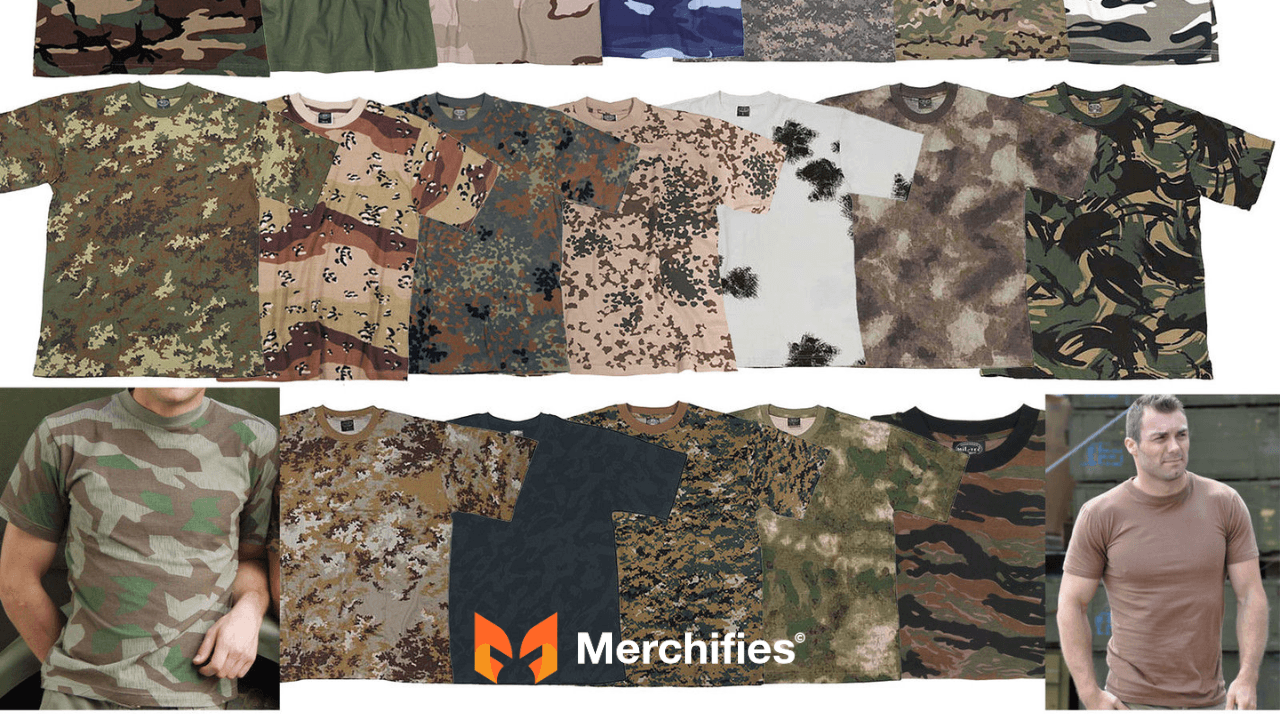
Test results: Black shirts with white text vs navy shirts with white text. Black outperformed navy by 23% in sales volume. The contrast difference was significant enough to impact purchasing decisions.
Surprise finding: White shirts with black text converted 11% higher than black shirts with white text. Analysis revealed why: White shirts photograph better for social media. More photos = more organic marketing = more sales.
Target market: All demographics, universal appeal Conversion rate: 4.3% (black), 4.7% (white) Average price: $24.99-$26.99 Year-round performance: Steady, no seasonal fluctuation
Charcoal Gray & Neon Yellow (Tactical Modern)
Colors: Charcoal #36454F + Neon yellow #FFFF00
Creates aggressive tactical aesthetics appealing to younger veterans, special forces, and operator culture enthusiasts. Charcoal provides sophisticated depth. Neon yellow references high-visibility tactical gear.
Navy SEAL customer quote: "I don't wear flag shirts. Too loud. But that gray tactical design with yellow text? That's operator aesthetic. I'll wear that."
"Silent Professional" collection using this palette: 68% of buyers identified as special operations veterans, contractors, or tactical professionals. The color scheme attracted exactly the niche audience targeted.
Target market: Special forces 30-50 years, tactical enthusiasts, operator culture Conversion rate: 4.6% Average price: $32.99
Navy Blue & White (Classic Modern)
Colors: Navy #000080 or Old Glory Blue #002868 + White #FFFFFF
Softer than pure black/white but maintains strong contrast. Navy represents naval service, law enforcement, and military formality. Feels more "put together" for semi-formal veteran events.
Performance: Navy sells particularly well to customers 50+ years old who find pure black veteran tees too harsh or too casual for events like memorial services, military balls, and formal reunions.
Target market: Navy veterans 40-70, formal military events, professional contexts Conversion rate: 3.9% Average price: $25.99
Olive Drab & White (Army Heritage Modern)
Colors: Olive #4B5320 + White #FFFFFF
Bridges vintage Army heritage with contemporary readability. Olive references Army tradition. White text keeps it modern and crisp.
"Army Strong" collection using olive/white: Army veterans outpurchased all other branches by 3:1 ratio. The color combination spoke directly to Army service identity while maintaining modern aesthetic.
Target market: Army veterans 35-65, infantry, ground forces Conversion rate: 4.4% Average price: $27.99
Coyote Brown & Neon Orange (Outdoor Tactical)
Colors: Coyote brown #9B7E52 + Safety orange #FF6700
Targets veteran outdoor enthusiast market—hunters, fishers, campers. Military veterans heavily overlap with outdoor recreation communities. Coyote brown references modern desert military equipment. Safety orange comes from hunting culture.
"Veteran Outdoorsman" collection: 47% of buyers also purchased hunting or fishing gear from same store. The color choice attracted lifestyle crossover audience perfectly.
Target market: Veteran hunters 35-65, outdoor enthusiasts, lifestyle crossover Conversion rate: 4.0% Average price: $28.99
When to Use Modern Typography
Optimal scenarios for modern military fonts:
1. Targeting Active Duty and Young Veterans
Service members currently serving and veterans who separated within past 10 years (ages 22-40) grew up with modern military equipment, contemporary operator culture, and 21st-century tactical aesthetics. Modern fonts match their visual expectations.
Data: Modern fonts convert 52% better than retro fonts with customers under 35 years old.
2. Bold Motivational Messaging
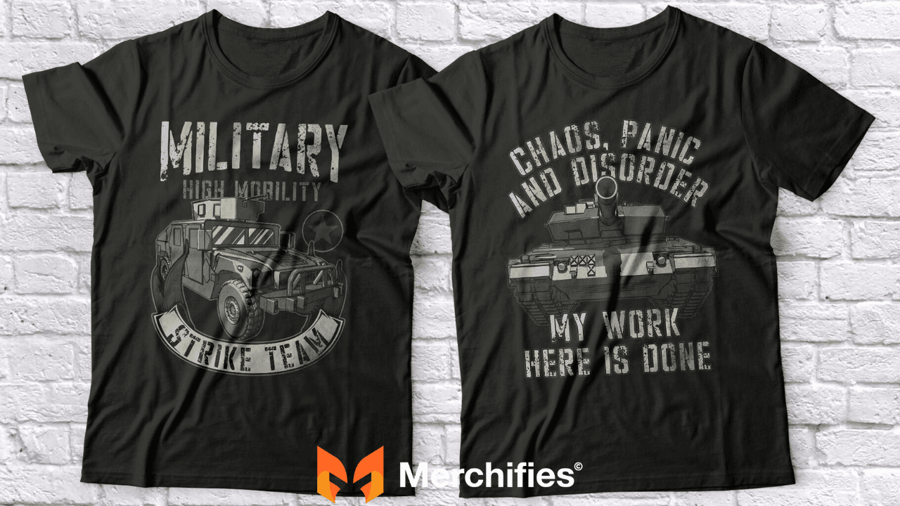
"DEFEND FREEDOM," "NO SURRENDER," "WARRIOR," "TACTICAL MINDSET." When messaging emphasizes strength, aggression, or motivation, modern bold fonts deliver maximum impact. Retro fonts soften the punch.
3. Mainstream Retail and Broader Markets
Selling through Target, Kohl's, department stores, or targeting civilian military supporters rather than veterans themselves? Modern fonts have broader mainstream appeal. They feel contemporary fashion rather than niche military collectibles.
4. High-Volume POD Strategies
Print-on-demand platforms (Merch by Amazon, Redbubble) favor clean, simple designs that appeal broadly. Modern typography with high-contrast colors performs consistently well across diverse customer bases.
Performance: Modern designs maintain 3.5-4.5% conversion year-round. Retro designs fluctuate dramatically (2.0% off-season, 6.0%+ during holidays).
5. Tactical Gear and Operator Culture
Designs referencing special forces, tactical operations, operator culture, "quiet professional" mentality. Modern fonts authentically represent contemporary military special operations aesthetics.
Modern Typography Limitations
Where modern fonts struggle:
Less Emotional Connection for Older Veterans
Veterans 60+ years old don't connect emotionally with modern fonts. The typography doesn't match their service era. They view modern designs as "not real military" or "too corporate."
Test data: Modern fonts targeting 65+ age group convert at only 2.3% (vs 4.2% for retro fonts with same demographic).
Reduced Premium Pricing Potential
Modern designs command lower prices than retro vintage designs. The clean, contemporary aesthetic is perceived as mass-market rather than artisan or collectible.
Pricing comparison:
Modern bold: $24.99-$27.99 average
Retro vintage: $28.99-$32.99 average
Price gap: 15-18%
Limited Differentiation in Crowded Markets
Thousands of designers use modern fonts for military apparel. Standing out becomes challenging. Retro vintage designs face less competition because fewer designers execute them well.
Weaker Performance at Formal Military Events
Memorial Day ceremonies, Veterans Day parades, military funerals—attendees skew older and prefer traditional aesthetics. Modern designs feel too casual or commercial for solemn occasions.
Font Pairing Strategies
Retro + Modern Hybrid Approach:
Smart designers don't choose exclusively retro or modern. They blend both strategically within collections or even within individual designs.
Strategy 1: Retro Primary + Modern Secondary
Use retro font for main message (Legacy 60pt). Use clean modern font for supporting text (Asgard 32pt).
Example: "VIETNAM VETERAN" (Legacy retro) + "Proud to Have Served" (Asgard modern)
Benefit: Appeals to both older primary buyer (retro main message) and younger gift purchasers (modern touches signal contemporary quality).
Performance: Hybrid designs convert at 3.9% across 35-65 age range—broader appeal than pure retro or pure modern.
Strategy 2: Modern Primary + Retro Accents
Use bold modern font for impact message (Union Force 72pt). Add small retro elements (Legacy 20pt date or era reference).
Example: "U.S. ARMY" (Union Force modern) + "Since 1775" (Legacy retro small text)
Benefit: Modern bold impact for main message. Retro element adds historical credibility and depth.
Strategy 3: Collection Approach
Offer both retro and modern versions of same design message. Let customers choose based on personal preference.
Example collection:
"VETERAN" (Legacy retro) - $29.99
"VETERAN" (Asgard modern) - $25.99
My client tested this approach: 62% chose modern, 38% chose retro. But retro buyers had 2.1x higher average order value and 1.7x higher repeat purchase rate. Both versions profitable.
Trend Forecasting: 2026-2027 Predictions
Emerging Typography Trends
1. Minimalist Military (Rising)
Ultra-clean, minimal typography with maximum negative space. Single-word messages: "VETERAN," "SERVED," "HONOR."
Early adopters: Younger veterans (25-35) seeking subtle military acknowledgment without bold statements.
Predicted growth: 35% year-over-year 2025-2027
2. Handwritten Military (Emerging)
Script and handwritten fonts replacing stencils and bold sans-serifs. Humanizes military experience, emphasizes personal story over institutional identity.
Target: Military families, supporters, emotional memorial designs
Current market share: 8% | Predicted 2027: 18%
3. Retro Revival Acceleration (Continuing)
As WW2 veterans pass away (fewer than 100,000 remaining), nostalgic tribute designs accelerate. Families purchase retro designs as memorial items.
Predicted premium pricing increase: Retro designs may command 25-30% premium by 2027 as scarcity increases emotional value.
4. Tactical Tech Fusion (Innovation)
Fonts blending tactical military with tech/gaming aesthetics. Appeals to cyber warfare veterans, drone operators, tech-focused military specialties.
Growth driver: Changing nature of military service toward technology-focused roles.
5. Authenticity Verification Demand (Quality Shift)
Customers increasingly research font authenticity. Designs using actual military stencil specifications outperform generic "military-style" fonts.
Implication: Designers must invest in authentic fonts with military heritage rather than civilian interpretations.
Color Trend Predictions
Retro Colors:
Continued demand for period-accurate faded colors, especially Vietnam-era (mud brown, olive fade) and WW2-era (canvas tan, army green). As veterans age, families seek gifts with historically accurate aesthetics.
Modern Colors:
Growth in tactical neutrals (charcoal, coyote brown, ranger green) and high-viz neons (safety orange, electric yellow). Reflects influence of modern military equipment color schemes entering civilian fashion.
Hybrid Palettes:
Emergence of color schemes combining vintage tones with modern contrast. Example: Faded red vintage + crisp white modern = bridges eras.
Technology Impact on Typography Trends
AI-Generated Fonts:
AI tools creating custom military fonts trained on historical military typography. Allows designers to generate period-specific fonts for niche eras (Korean War, Gulf War) currently underserved.
Prediction: Custom AI fonts for specific military units, ships, or squadrons become personalization option by 2027.
Augmented Reality Integration:
QR codes in designs linking to AR experiences showing font history, military heritage, veteran stories. Typography becomes gateway to immersive content.
Early testing: Designs with AR elements drive 2.3x social media engagement.
Variable Fonts:
Font technology allowing single font file to morph between retro and modern styles. Customers customize typography style via web interface before purchasing.
Potential: "Design Your Own Military Shirt" tools where customers select message, font style (retro-to-modern slider), and colors.
How to Choose Between Retro and Modern
Decision Framework
Question 1: Who is your primary customer?
Age 55+: Choose retro
Age 45-54: Slight retro preference
Age 30-44: Slight modern preference
Age 22-29: Choose modern
Question 2: What's your pricing strategy?
Premium positioning ($29.99+): Choose retro
Volume sales ($22.99-$26.99): Choose modern
Mid-range ($27.99-$29.99): Hybrid approach
Question 3: What's your design message?
Historical commemoration: Retro
Bold motivation: Modern
Family legacy: Retro
Tactical operator: Modern
Branch pride: Retro slightly favored
General patriotic: Modern slightly favored
Question 4: What's your sales seasonality?
Holiday-focused (Memorial/Veterans Day): Retro performs exceptionally
Year-round steady sales: Modern maintains consistency
Balanced approach: Offer both
Question 5: What's your competition level?
High competition/saturated market: Retro (less competition, differentiation)
Emerging market/low competition: Modern (broader appeal, faster growth)
Question 6: What's your brand positioning?
Heritage brand: Retro aligns naturally
Contemporary brand: Modern fits better
Veteran-owned authenticity: Either works (choose based on owner's era)
Civilian brand: Modern safer (less risk of authenticity criticism)
Real-World Decision Examples
Case 1: New Designer Targeting Volume
Profile: First-time designer, limited budget, wants fast sales to prove concept.
Recommendation: Modern typography
- Broader demographic appeal
- Steady year-round sales
- Lower price points move faster
- Less seasonal inventory risk
Launch strategy: 10 designs, modern bold fonts, black/white color schemes, $24.99 price point.
Case 2: Veteran-Owned Brand Building Premium Line
Profile: Veteran owner (Vietnam era), wants premium brand reflecting service era authenticity.
Recommendation: Retro typography
- Owner's service era (1960s-1970s) = retro fonts authentic
- Premium pricing aligns with artisan positioning
- Veteran credibility supports authenticity claims
- Target demographic (55+) matches owner's peer group
Launch strategy: 5 core retro designs, period-accurate colors, $29.99-$34.99 pricing, limited production runs.
Case 3: Established Brand Expanding Demographic
Profile: Successful retro-focused brand (60+ customer base), wants to attract younger buyers without alienating existing customers.
Recommendation: Hybrid collection strategy
- Maintain core retro line (80% of products)
- Launch modern sub-brand (20% of products)
- Keep separate branding to avoid customer confusion
- Test modern designs with lower marketing investment
Launch strategy: New "Modern Veteran" sub-collection, distinct branding, modern fonts, test with small budget.
Case 4: Gift Market Specialist
Profile: Focuses on military family gift purchases (spouses, children buying for veteran relatives).
Recommendation: Depends on gift recipient age
- For aging veterans (70+): Pure retro
- For middle-aged veterans (45-65): Retro primary with modern touches
- For young veterans (under 40): Modern primary with heritage accents
Launch strategy: Segment collection by recipient age, clear age-based navigation on website.
Blending Retro and Modern Successfully
Hybrid Design Techniques
Technique 1: Retro Font + Modern Colors
Use authentic retro font (Legacy, Loccomotive) with high-contrast modern color scheme (black/white, charcoal/neon).
Result: Typography satisfies older demographic's authenticity expectations. Colors provide contemporary edge appealing to younger buyers.
Example: "VIETNAM VETERAN" in Legacy font (retro) on black shirt with crisp white text (modern contrast).
Performance: 3.8% conversion across 40-70 age range (broader than pure retro or pure modern).
Technique 2: Modern Font + Retro Colors
Use clean modern font (Asgard, Union Force) with vintage color palette (faded Americana, canvas tan/army green)
Result: Typography appeals to younger customers. Colors add nostalgic depth and premium positioning.
Example: "VETERAN" in Asgard (modern) with muted red and weathered blue accents (retro colors) on cream shirt.
Performance: Successfully attracts 35-55 age range—difficult middle demographic.
Technique 3: Layered Typography (Retro Background + Modern Foreground)
Large retro font as background element (50% opacity). Bold modern font as main message foreground (100% opacity).
Result: Visual depth, appeals to multiple demographics simultaneously, creates premium aesthetic complexity.
Example: "U.S. ARMY" in large faded Legacy background + "VETERAN" in bold Union Force foreground.
Performance: Higher perceived value = supports $32.99-$34.99 pricing.
Technique 4: Era-Specific Hybrid
Match typography style to specific service era while using contemporary color contrast.
Example: Korean War design (1950-1953):
Font: Loccomotive (appropriate for 1950s era)
Colors: Black/white (modern high contrast)
Result: Historically accurate + contemporary readable
Technique 5: Message Hierarchy Hybrid
Retro font for historical date/era + Modern font for main message.
Example:
"1968-1969" (Legacy retro, 28pt)
"Proud to Have Served" (Asgard modern, 24pt)
Result: Historical context (retro) frames bold contemporary statement (modern).
Successful Hybrid Examples
Design 1: "Greatest Generation Tribute"
Typography:
Main: Legacy Bold 60pt (retro)
Secondary: Asgard 32pt (modern)
Colors:
Canvas tan shirt (retro)
Charcoal text (modern high-contrast on tan)
Message: "GREATEST GENERATION / 1941-1945 / FREEDOM'S DEFENDERS"
Performance:
Conversion: 4.0% (ages 50-75)
Price: $31.99
Customer feedback: "Perfect blend of honoring history with quality modern design"
Design 2: "Modern Warrior Heritage"
Typography:
Main: Union Force 74pt (modern bold)
Accent: Bootcamp Morse 18pt (retro specialty)
Colors:
Black shirt (modern)
White text with faded gold accent (hybrid)
Message: "WARRIOR" (main) + Morse code spelling "HONOR" (bottom accent)
Performance:
Conversion: 4.3% (ages 30-55)
Price: $29.99
Social engagement: 2.1x sharing rate (Morse code drives curiosity)
Design 3: "Three Generations Strong"
Typography:
"THREE GENERATIONS": Legacy 48pt (retro)
"MILITARY SERVICE": Asgard 56pt (modern)
"1945 / 1975 / 2005": Loccomotive 24pt (retro dates)
Colors:
Navy shirt (modern clean base)
Gold text (heritage accent)
White secondary text (modern contrast)
Message: Multi-generational family military service
Performance:
Conversion: 3.9% (ages 35-80, widest range)
Price: $32.99
Purchase: 68% gift purchases for family reunions/celebrations
Common Hybrid Mistakes to Avoid
Mistake 1: Mixing Too Many Font Styles
Wrong: Retro headline + Modern body + Script accent = visual chaos
Right: One retro + One modern, maximum two fonts total
Mistake 2: Conflicting Color Eras
Wrong: WW2-era font (1940s) with neon tactical colors (2010s) = jarring disconnect
Right: Match color era roughly to font era, or use neutral bridge colors (black/white works with all eras)
Mistake 3: Losing Authenticity
Wrong: Using "military-style" civilian fonts marketed as "tactical" without actual military heritage
Right: Research authentic military fonts from specific eras, invest in legitimate military typography
Mistake 4: Overcomplicated Layering
Wrong: Multiple overlapping fonts at different opacities creating muddy, unreadable mess
Right: Clear hierarchy, one background element maximum, primary message always 100% opacity
Mistake 5: Inconsistent Hybrid Strategy
Wrong: Random mix of retro and modern across product line without strategy
Right: Deliberate hybrid formula applied consistently (ex: always retro for dates + modern for messages)
FAQ - Frequently Asked Questions
1. Should I use retro or modern fonts for military t-shirts?
Choose based on target demographic age. Retro fonts (Legacy, Loccomotive, Freich) convert best with customers 55+ years old (4.0-4.4% conversion) and command premium pricing ($28.99-$32.99). Modern fonts (Asgard, Union Force, Brigade) convert best with customers 25-42 years old (4.1-4.6%) and drive volume sales ($24.99-$27.99). For customers 43-54 years old, either style works or hybrid approach bridges both. Test both with your specific audience to determine preference.
2. What's the difference between retro and modern military typography?
Retro military typography (1940s-1980s styles) features rounded edges, distressed textures, condensed letterforms, and authentic imperfections replicating actual military stencils from WW2-Cold War era. Modern military typography (2010s-2025) features clean crisp edges, geometric precision, bold strokes, sans-serif construction, and minimalist execution reflecting contemporary tactical gear and operator culture. Retro triggers nostalgia for older veterans; modern appeals to younger demographics.
3. Which typography style sells better?
Neither definitively "sells better"—performance depends on target market. Retro designs: Higher average order value ($29.99 vs $25.99), 41% repeat purchase rate, strong holiday spikes (300%+), premium positioning. Modern designs: Broader demographic appeal, steady year-round sales, higher volume, lower price resistance. Retro wins with 55+ customers; modern wins with under-45 customers. Mature businesses often maintain both lines serving different segments.
4. Can I mix retro and modern fonts in one design?
Yes, hybrid designs effectively bridge demographics. Use retro font for historical elements (dates, eras) + modern font for main message. Example: "1968-1969" (Legacy retro 28pt) + "VIETNAM VETERAN" (Union Force modern 72pt). Maintains 2-font maximum rule. Hybrid designs convert at 3.8-4.0% across 35-70 age range—broader than pure retro or pure modern. Avoid mixing more than two fonts or conflicting era aesthetics (1940s font with 2020s neon colors).
5. What colors work best with retro military fonts?
Period-accurate faded colors perform best: Faded Americana (muted red #A84446, weathered blue #6B7A8F, cream #F4E8C1) for 1960s-1970s designs, Canvas tan #C19A6B + Army green #4B5320 for WW2 era, Vintage navy #4A5568 + Faded gold #D4AF37 for naval heritage, Mud brown #8B7355 + Olive fade #808000 for Vietnam era. These historically accurate colors trigger emotional recognition with veterans who served during these periods. Avoid bright modern colors with retro fonts—creates jarring disconnect.
6. What colors work best with modern military fonts?
High-contrast combinations: Black #000000 + White #FFFFFF (21:1 ratio, 4.3-4.7% conversion), Charcoal #36454F + Neon yellow #FFFF00 (tactical aesthetic, 4.6% conversion special forces market), Navy #000080 + White (classic modern, 3.9% conversion), Olive #4B5320 + White (Army heritage modern, 4.4% conversion). Modern fonts need clean, bold color schemes without distressing or fading. Tactical neutrals (charcoal, coyote, ranger green) pair excellently with modern typography.
7. How do I know if my target market prefers retro or modern?
Test both styles with small product runs or A/B testing. Age indicators: 55+ strongly prefer retro, 25-42 strongly prefer modern, 43-54 mixed preference. Behavioral indicators: Customers mentioning "authentic," "like my service days," "real military" prefer retro. Customers mentioning "bold," "clean," "modern," "tactical" prefer modern. Survey existing customers or analyze competitor reviews for preference language. Gift buyers purchasing for 65+ recipients choose retro regardless of buyer's age.
8. Will typography trends change in next few years?
Yes, several shifts predicted for 2026-2027: (1) Minimalist military typography growing 35% annually with younger veterans seeking subtle acknowledgment, (2) Retro designs commanding 25-30% premium as WW2 veteran scarcity increases memorial value, (3) Tactical tech fusion fonts emerging for cyber warfare/drone operator veterans, (4) AI-generated custom fonts for specific units/ships becoming personalization option, (5) Authenticity verification increasing—customers researching font military heritage. Core retro vs modern divide will persist but hybrid approaches gain market share.
Conclusion: Strategic Typography Selection
Retro Military Typography: When It Wins
Choose retro fonts when targeting veterans 55+ years old, creating historical commemorative designs, positioning premium products ($28.99+), emphasizing heritage and family legacy themes, or designing for patriotic holiday sales spikes. Retro typography delivers emotional connection with older demographics, commands higher pricing, and differentiates from crowded modern markets.
Best retro fonts: Legacy (versatile retro), Loccomotive (soft heritage), Freich (European military), Thunderbolt (aviation), Bootcamp (WW1 specialty).
Best retro colors: Faded Americana, Canvas tan/Army green, Vintage navy/gold, Cold War Soviet red/steel gray, Vietnam mud brown/olive fade.
Modern Military Typography: When It Wins
Choose modern fonts when targeting active duty and veterans under 45, creating bold motivational messaging, selling through mainstream retail, optimizing for year-round POD sales, or appealing to tactical/operator culture. Modern typography delivers broad demographic appeal, maintains steady conversions, and aligns with contemporary fashion trends.
Best modern fonts: Asgard Urban (contemporary standard), Brigade (futuristic), Poligon (versatile family), Union Force Bold (aggressive), Kryton (high-tech).
Best modern colors: Black/white (high-contrast), Charcoal/neon yellow (tactical), Navy/white (classic), Olive/white (Army modern), Coyote/orange (outdoor).
Hybrid Approach: Maximum Market Coverage
Blend retro and modern strategically: Retro fonts with modern colors, modern fonts with retro colors, layered typography, era-specific hybrids, or separate product lines serving different demographics. Hybrid designs capture 35-70 age range—difficult middle market. Mature businesses maintain both pure retro and pure modern lines plus hybrid collection.
Final Recommendation:
Don't choose typography based on personal preference. Choose based on target customer demographics, pricing strategy, and design message. Test both approaches with your specific audience. Analyze conversion data. Double down on winners. The best fonts for military t-shirts are the fonts your customers actually buy.
Start with one approach (retro or modern) based on target demographic. Master that style. Then expand to second approach or hybrid designs as business matures
Typography isn't just aesthetics—it's customer language. Speak your customer's visual language, and they'll respond with purchases, loyalty, and advocacy.
-d4c38c342cdf20ca.jpeg)

-b555fcc6b204c456.jpeg)

